


@Panther :+1:
Forums Feedback Redux
-
I’m looking for feedback to make things a little better. Keep in mind that answers to feedback might be a change, education on how to do that thing, or we can’t do anything about it.
Please be explicit in what you’re trying to accomplish. Provide screenshots as necessary.
Please use this vocabulary:
- Category list page (the “home page”)
- Nested categories or sub-categories
- These are on both the category list page and on the topic list page at the top
- Topic list page (list of topics in a category)
- Topic page (the conversation thread)
- Composer (the thing you use to write or reply to a topic)
If you have feedback about colors and design, first check out the various themes to make sure it isn’t fixed by using a different theme. After that be extra explanatory about it. If there is something you don’t like, figure out why you don’t like it and explain. Here’s a good example,
I don’t like all the whitespace. The reason is that the main content of the forums blends in with the white background and it overwhelming. It also makes it more difficult to differentiate between the spots where one post ends and the other starts.
Also, with regard to that sample feedback. I’m going to make changes to make things a little more like this forum: https://community.prototypr.io/
It has a slightly contrasted background with panels around topics and posts.
Timeline
I’m busy with work until April 12 so I won’t be able to start anything until after that. If anybody wants to make some videos, I’m not going to say no in fact, I welcome it.
Your Part
I will take your feedback and make changes but the folks who are patient and continue to involve themselves in the community during this transition get priority. If you say you don’t like something and stop coming here, I’ll focus on feedback from folks who are still here. Sorry but it is a two way road and I can’t change you from being stubborn if you’re not willing to be patient.
Finally use the Unread page (inbox icon third from the left on the top navbar). It shows all the posts you’ve missed. If you’re seeing TripleA games on that page, let me know in a chat message.
-
Note: I’m thinking of using this post to collect the feedback and also to answer questions so folks don’t have to scroll through the entire conversation.
General action items:
- Helping knowing who posted last on all categories, including the nested sub-categories (I might have an idea)
- Knowing which conversations you’re involved in. (I’ll see if the NodeBB team can add a watched icon)
- A little less whitespace and more borders. Slightly more table-like.
- Education, videos, tips to cover the above issues and others
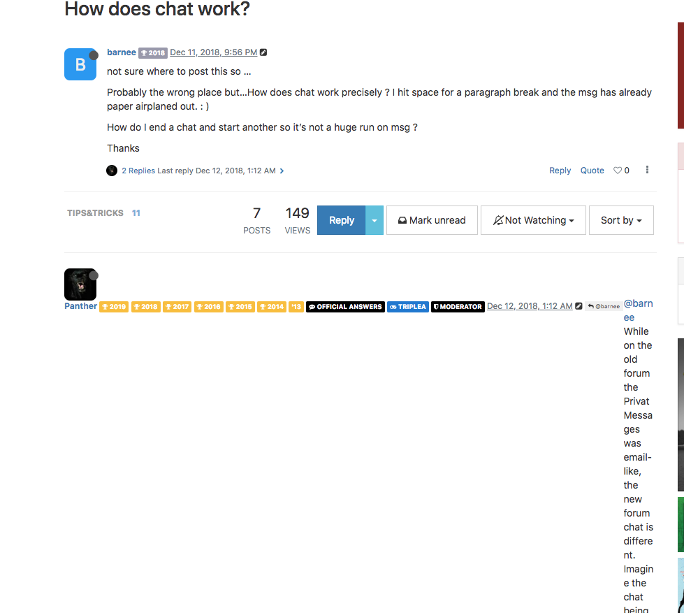
When I click a topic, it doesn’t take me to the first post. It takes me to the end or sometimes the middle. This is confusing.
What’s happening here is that the forum software is trying to be helpful and insert you where you left off in the thread. For instance, imagine a topic with 5 pages of posts. Let’s say that you want to read all of them and you get to page 3 and have to stop. When you come back to that topic, the forum software puts you where you left off. Another scenario: you’ve read an entire thread for a topic and left off at the end and then 10 replies come in later. When you revisit that topic, the forum software will automatically take you to the last post that you read so that you can continue where you left off.
Coming from the old forums, this is confusing. However, new users might find this super useful. You might even find this useful, sometimes. I will ask the NodeBB team about this situation to see what can be done.
My first thought is that when you click the post date, it takes you to the first post. (It doesn’t do that yet).
-
When I am viewing a subforum, is there a way to quickly do a search of that sub-forum only? It seems like other forums (and possibly the old one?) had this ability. Unless I’m missing something, now I have to click the search icon i the top bar, then choose the subforum I was viewing from a dropdown list, then type my search query, etc.
Totally fine if that option still exists (The advanced search with all the options/parameters, etc), but is a quick subforum search also possible?
-
@Intrepid said in Forums Feedback:
When I am viewing a subforum, is there a way to quickly do a search of that sub-forum only? It seems like other forums (and possibly the old one?) had this ability. Unless I’m missing something, now I have to click the search icon i the top bar, then choose the subforum I was viewing from a dropdown list, then type my search query, etc.
Totally fine if that option still exists (The advanced search with all the options/parameters, etc), but is a quick subforum search also possible?
To my knowledge, it is not currently possible. I can ask around though.
-
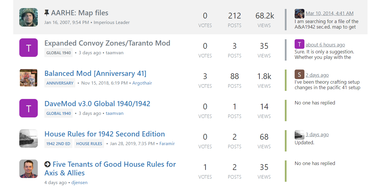
Why does a post Nov 15, 2018 show up higher in the list than your post from 4 days ago. The votes?
If so, don’t care about the votes, care more about the date.
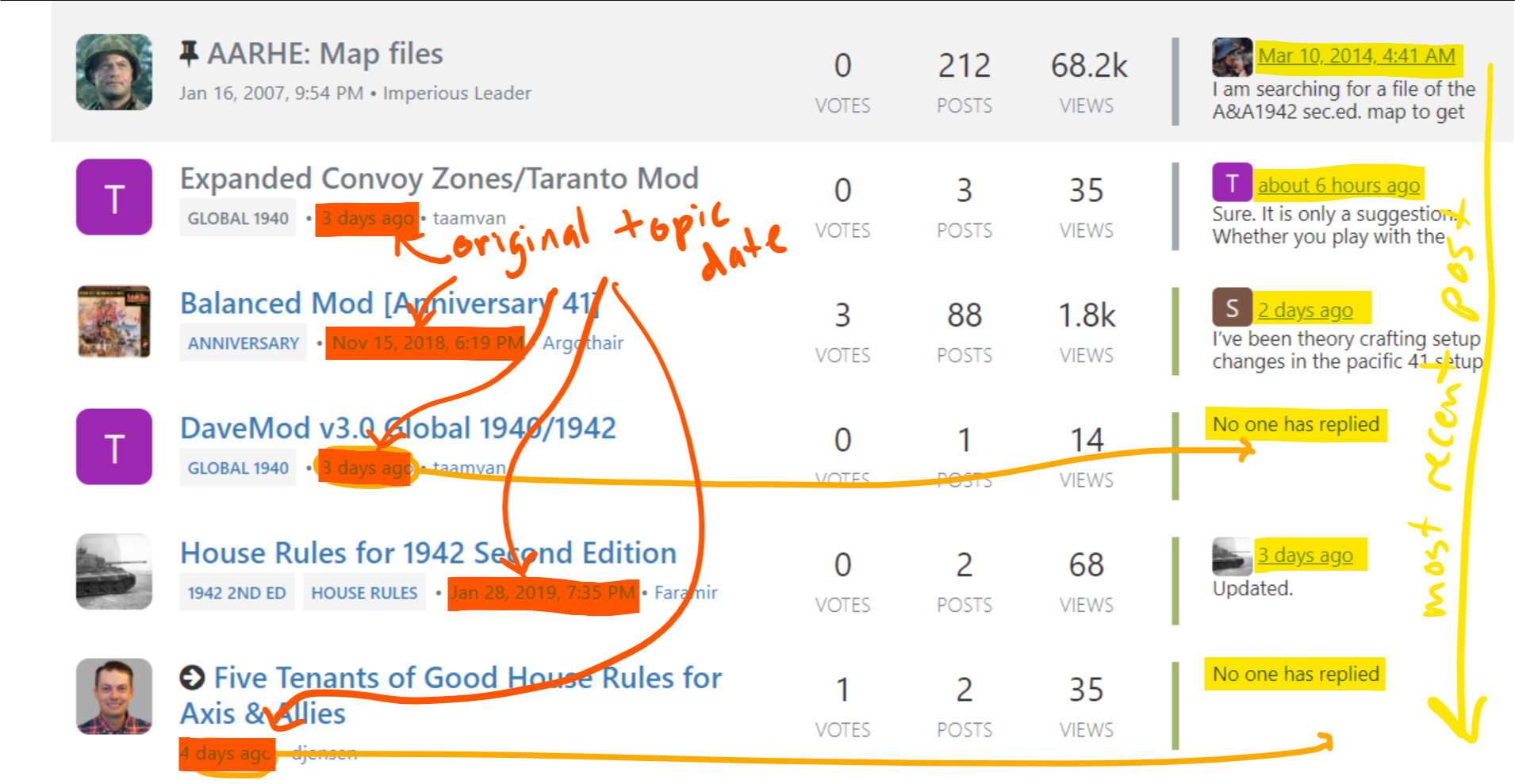
It might be good if one could sort/filter on votes, posts date, views, etc.
Also, it could be nice if one could hide all the pinned posts. Often it takes a page of scrolling to get past them.
In general, posts, avatars, etc. seem to take up much more real estate and require more scrolling than in the old site. Less scrolling, less clicking…more content. is better.
-
@sjelso The non stickied topics are sorted by the date of the latest “entry”. Compare @djensen 's time of writing his post with the reply-dates of the other topics to be seen on the right side of your image. Every entry is newer, with the latest entry on top. Votes are totally unrelated.
See https://www.axisandallies.org/forums/topic/32439/category-and-topic-sorting-questions , too.
-
Why does a post Nov 15, 2018 show up higher in the list than your post from 4 days ago. The votes?
Take a look at the “dates” in the far right column. Like the old forums, this is where the most recent reply/post on the topic is listed. This is the date that is sorted.
The date that you’re looking at is the original topic date, which is new. Both pieces of information are useful for different reasons but the most recent activity date, IMO, is the more important one. Not sure about the best way to fix this. I can bring it up to the NodeBB team see if they have ideas. See marked up screenshot below.
If so, don’t care about the votes, care more about the date.
:thinking_face: Yeah, I really want people to use the heart/vote more but for different reasons. The heart button is too subtle anyway. I’ll consider removing this. The formatting gets a little messed up if I just hide it though, ugh.
It might be good if one could sort/filter on votes, posts date, views, etc.
Sort controls are available. Take a look at the top menus. Filtering controls are core so I’d have to suggest to the NodeBB team and we’ll need more details.
Also, it could be nice if one could hide all the pinned posts. Often it takes a page of scrolling to get past them.
I think the best way to solve this is fewer pinned posts. I know @Imperious-Leader liked pinning everything but it’s too much. I’ve been creating rollups or merged topics from previously pinned topics. The number of pinned topics is about the same as before but the non-dense format exacerbates the problem. I’ll bring this up to the NodeBB team as well.
In general, posts, avatars, etc. seem to take up much more real estate and require more scrolling than in the old site. Less scrolling, less clicking…more content. is better.
You are correct, more vertical space is being used. This is compromise between usability and density. If you’re not used to it something overly dense is hard to take in. Most modern social media sites don’t use the early 2000s style of content density anymore. This is important because those who are new to the site are more accustomed to the new style of social media; comfortable to read. It turns our the “graphics” are only marginally larger on some pages and they’re actually smaller on others.
There are two things I can do with this feedback:
- Suggest that the NodeBB team create a “compact” view for the theme we’re using. I would like them to address it because I want it to be an option and not the default behavior.
- I want to create less white space and introduce more borders. The idea is to make everything seem less free floating and more “together”.
Take a look at this forum: https://community.prototypr.io/
The density is technically the same if not more sparse but the borders and grey background make all the difference. It make scanning easier, etc.
Dave Jensen, Founder of Axis & Allies .org
-
@djensen Thanks for the tips. Yes, the lines on the prototype site help!
-
@sjelso said in Forums Feedback Redux:
@djensen Thanks for the tips. Yes, the lines on the prototype site help!
I almost did this the other night then realized it was a lot more work than I expected, especially because I also have to do something for the dark themes too. After April 12, I’ll be working on this, for certain.
-
I see no conflicts whatsoever. Everything is predicated on the most recent post. That includes the original post if it was created within that sequence. Also, the votes thing is really stupid and useless and adds zero value to this site. It means nothing and nobody would use it to determine what to look at. Its nothing more than a “beauty contest”. Actually, the thing you had for individual posters…forgot what you called it… sort of “prestige rating” of individual members… that was a waste too.
Lastly, what is needed is to toggle OFF sections of new reply’s of entire categories. For example, i don’t want to sort thru pages of online games being played. I don’t consider these as posts. I only want to see anything else. The ability to just not see the tun by turn posts of online games would be great.
-
@Imperious-Leader said in Forums Feedback Redux:
Also, the votes thing is really stupid and useless and adds zero value to this site. It means nothing and nobody would use it to determine what to look at. Its nothing more than a “beauty contest”. Actually, the thing you had for individual posters…forgot what you called it… sort of “prestige rating” of individual members… that was a waste too.
The votes thing is great if you want to say “me too” or “I like” or “great idea” without wasting everybody’s time with actually writing that. People, you really should use this feature. I also want to use it to encourage lurkers to participate more. Read a post, like it. The biggest problem with it is that it’s nearly unnoticeable that you can or should do it.
However, the vote count is quite useless because people aren’t using it. That’s actually the case for most NodeBB forums. I’d like an easy way to remove the count from the listing but I don’t have that yet.
Lastly, what is needed is to toggle OFF sections of new reply’s of entire categories. For example, i don’t want to sort thru pages of online games being played. I don’t consider these as posts. I only want to see anything else. The ability to just not see the tun by turn posts of online games would be great.
A. It should be toggled off already. I ran the script to “unwatch” everybody and if it didn’t work, I need to know.
B. You can do this yourself. I think @Panther’s #1 new job is going around telling people how to do this. ;-)Dave Jensen, Founder of Axis & Allies .org
-
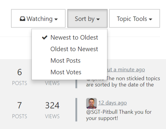
How to “Ignore” a category globally in all lists of stuff:
-
@sjelso
as Djenson and others have said, you can turn stuff off with the ignoring thingy. The Forum games are turned off by default. What I’ve found to work best, is to click on the blue unread icon and then hit on the sidebar which shows which ones i might wanna read. When I click one, it takes me to the last post in that thread and I scroll back.If I haven’t read anything in that thread, I click on the topic and it starts at the beginning.
A neat feature is the “mark all as read” thingy. After I read or check on things I’m interested in, I hit that, and it whacks all the other posts.
Anyway, while not perfect, I think the new site does have some valuable options. Mainly being able to turn off all the Forum games. It also seems as if the nodebb guys are actively working on making things better, so I would imagine there will be improvements too. : )
-
@barnee said in Forums Feedback Redux:
It also seems as if the nodebb guys are actively working on making things better, so I would imagine there will be improvements too. : )
This is definitely an unintended benefit of moving to NodeBB. The NodeBB team releases every 2-3 months and fixes bugs very quickly. They are also quite receptive to suggestions and new ideas. They are a little slower on some issues but they’re always moving the platform forward. Since I’m familiar with programming JavaScript and Node.js I’ve even submitted a few fixes myself.
I think release 1.10 in December was 50% bugs reported by @Panther and I.
-
@djensen sweet : )
With more people familiar with it, maybe you will get some experienced volunteer help down the road to lighten your load : )
-
@djensen said in Forums Feedback Redux:
…
B. You can do this yourself. I think @Panther’s #1 new job is going around telling people how to do this. ;-)That is a great opportunity to bring our “Tips&Tricks” tag back to attention:
Since the beginning of the relaunch of the forum we have tagged all NodeBB-forum-related hints with the “Tips&Tricks” tag.

Those can be easily accessed by klicking on the tag, that leads to
https://www.axisandallies.org/forums/tags/tips&tricks
All related topics are to be found in the Website/Forum Discussion category.Ignoring categories for example is covered here:
https://www.axisandallies.org/forums/post/1236369The more feedback we get and the more “how-to” questions we get, the more the “Tips&Tricks” can be and will be expanded :slightly_smiling_face:
I am now adding that tag to this topic, too. ;-)
-
@Panther Hi, just browsing the tips & tricks link that you linked to… clicked on a couple of topics, and your answers are formatted strangely for my view… (below)… is this happening to anyone else?
-
@Intrepid It is looking fine for me right now.
See: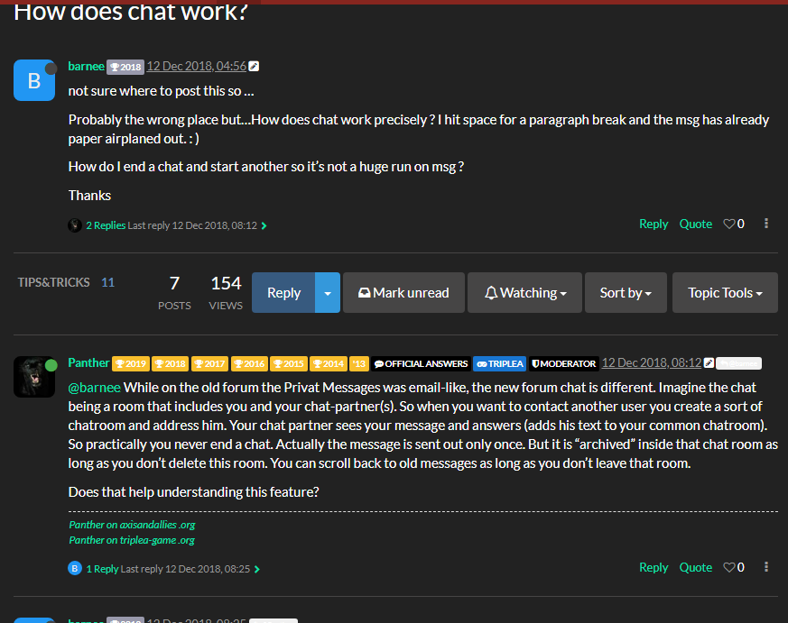
But I have experienced this strange appearance myself a couple of times before.
This is a bug with the forum software that I have already filed at NodeBB on Github. At the moment it is supposed to be fixed with version 1.12.1. (We already are at 1.12.0.)Maybe try a hard refresh. How does it look when you are logged off?
-
@Panther This last post of yours did the same thing for me. Soft refresh didn’t work, I logged off and after a half-dozen more freshes, suddenly the post appeared properly. Logged back in, and it’s still good.
-
@Intrepid Thank you for testing this. I hope they get it fixed soon.
Suggested Topics

