


Sorry only just saw this
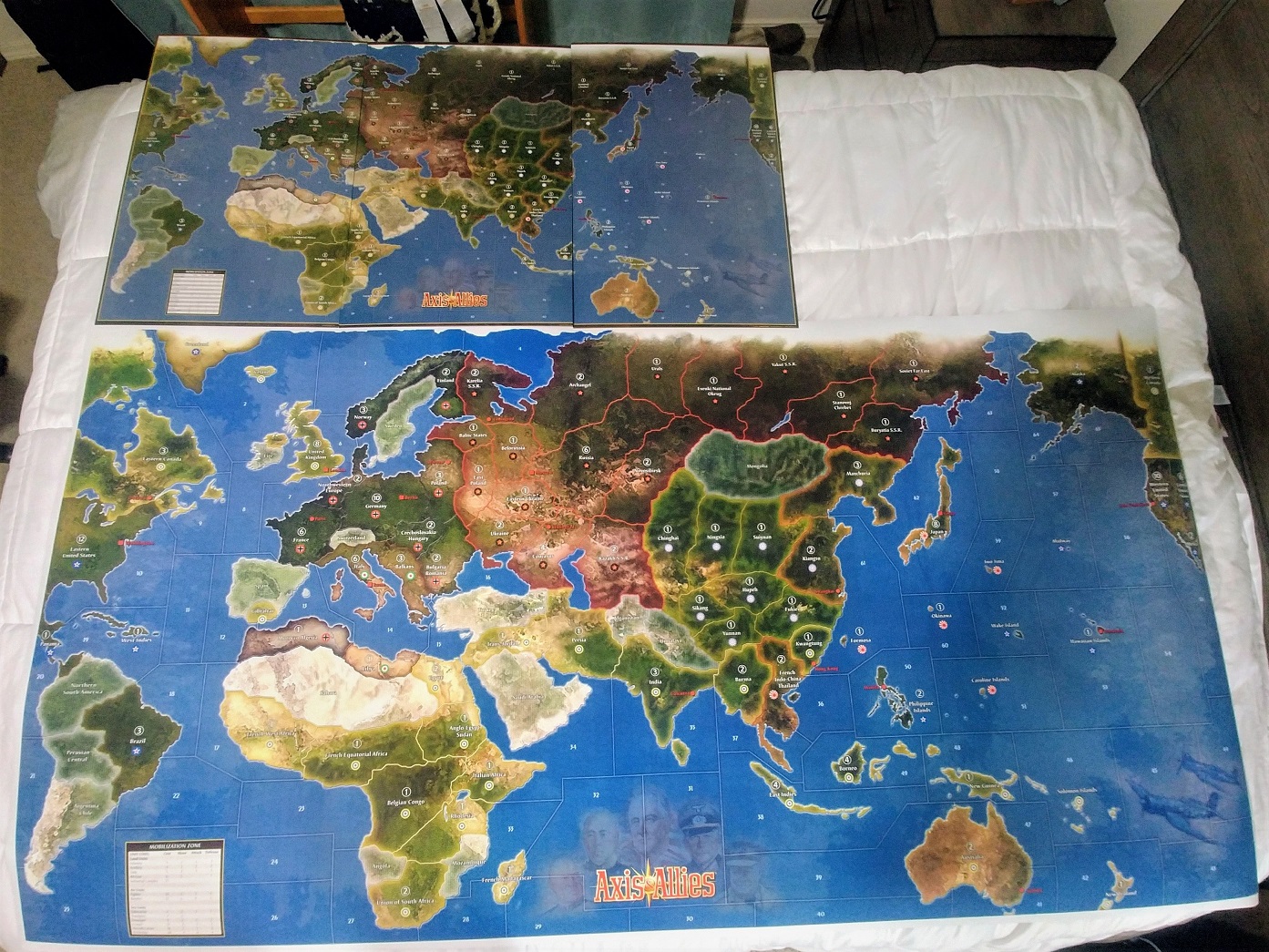
So step one would be finding the right image editing program for what you’re trying to achieve. TripleA uses raster graphics images (basically png) and is not suitable for printing. Upscaling the largest relief I’ve made in tripleA and trying to print it at 600 dpi the filesize gets quite beefy. Basically an image that’s like 50mb for use in tripleA is going to climb way up by orders of magnitude into the many gigabytes. It will also tax the RAM pretty hard if you’re trying to edit an image that large (in actual dimensions) like trying to use multiple layers at once. I have a pretty high end gaming laptop and I topped out around 8000p before GIMP started giving me headaches and slowing to a crawl.
What you probably want is an image that you can manipulate as SVG rather than PNG. A vector so you can upscale the image to any dimensions that way (basically the same way font works.) I would try Inkscape or Adobe, and try to get a pull of the image as a vector graphic.
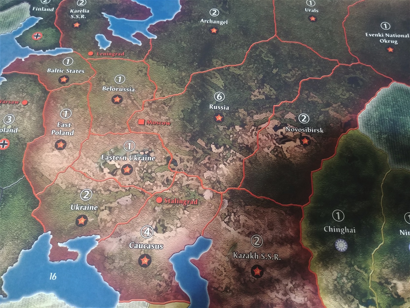
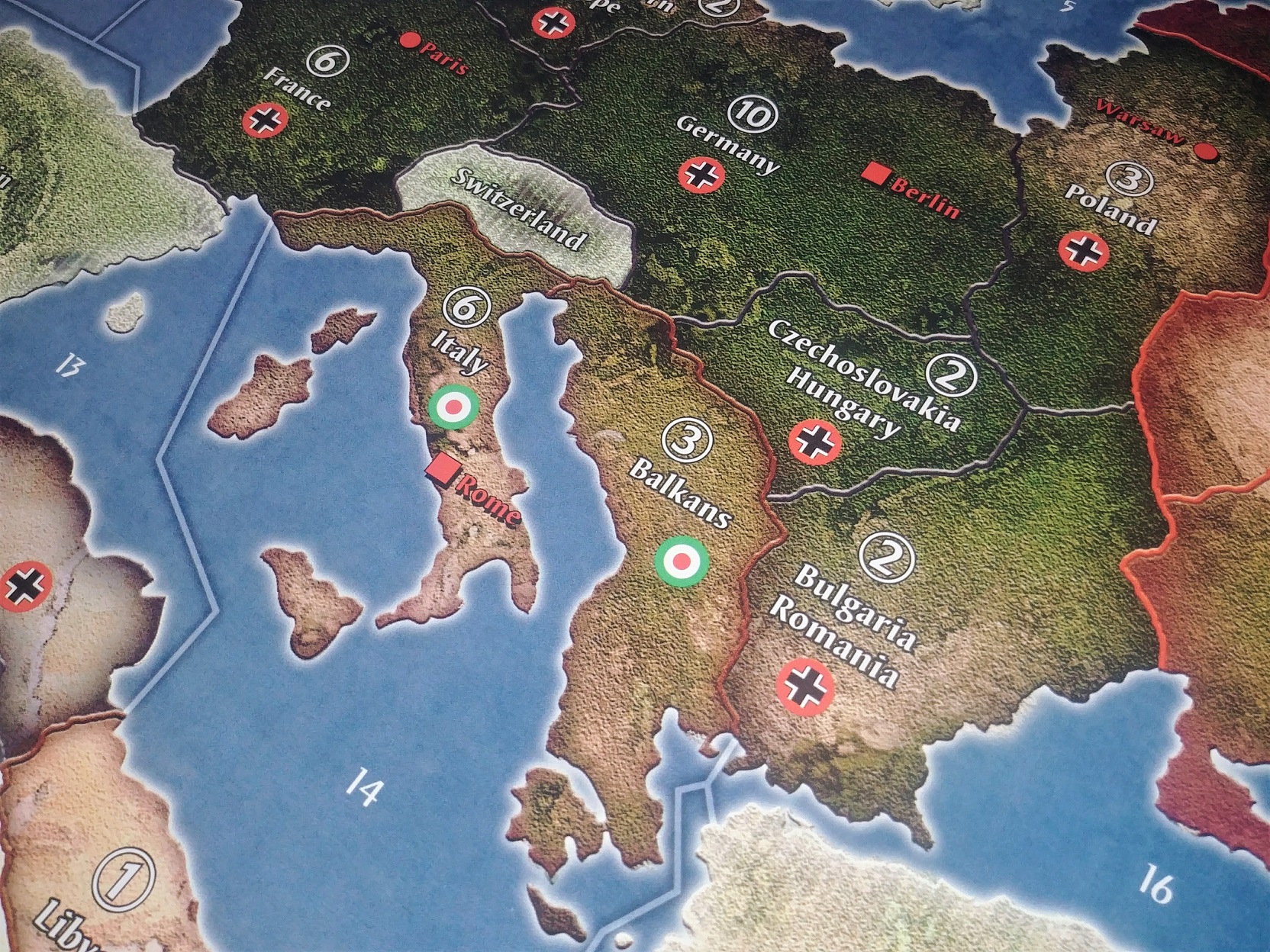
You can start the same as you would in tripleA by creating a baseline image of the basic world map, the continent contours or world warp you want and the territory or sea zone divisions, showing just the basic borderlines in 100% black at 1px width at the desired dimensions for the digital thing.
A physical print would be much larger, so imagine that on your screen you got 72p per inch, on paper that needs to be 600 dpi. You can go lower say 300 dots per inch if it’s very graphic, but a photo quality print is basically like 600p, which is pretty hefty. In a program like inkscape or illustrator etc you can translate a raster image into something that works for stuff like signage, you know, so like making a giant banner image to put on the side of a truck or hang outside a building - same sorta deal here for the scale of the image you’d want to make. Probably the size of a 6 or 8 foot banquet table, possibly larger depending, on what you’re trying to pull off.
If you have the map drawn out at scale, you can scan in sections at A3 or A4 size with a flat scanner and then reassemble the image, to pull it at the highest resolution you can before bringing that image into inkscape to create a vector of it.
ps. here are some youtube tutorial videos on inkscape just to see what sort of stuff I mean. You can probably find more just pulling at those threads. Once you have a map design you can put in tripleA to playtest it by creating a baseline from your svg, exporting the image as a bitmap or png where the borderlines are just solid black ideally at 1px width for those lines, or as close as you can get. For a map image something that’s like 2000-4000p tall and about twice as wide or larger works well for digital sculpts which are png images at 48-54px tall up to 125% currently in tripleA. The map size in tripleA is sorta limited by the unit graphics sizes and the windows in the UI. In inkscape you can make it larger, like for whatever makes sense to have the print look decent. Anyhow, just a quick example you can skip around to see
https://www.youtube.com/watch?v=6Ns028ihACs&list=PL_NagE_y_IhIBNAzw3nFBiF01OKnaltmJ
https://www.youtube.com/watch?v=DnqtnSTe6qM
https://youtu.be/kS2nrXuR128?t=2611
for tripleA you can use GIMP to make the relief images in png. Here’s an example of similar videos in that program


