


Sweet!
Ultimate map (cancelled by Wizards!)
-
OK,
After seeing what Nimitz did with a wall mounted map, he really lit a fire underneath me to do it too. This is not meant to slight his map (which is really good after all), but I wanted the EXACT map on the wall (plus maybe a tweak or two that I like :-D). It just looks too beautiful to not be done as good as my abilities allow. Here is the link, http://www.megaupload.com/?d=JY05IHUK
So, I have had to jump into using Photoshop for the very first time. Wow, that is a complex program to learn for a newbie!!! To date, I have the left panel of the Europe map stitched together and corrected. Things to note: I expanded the left edge of the map so that I could add new territory and make Manitoba and the Central US connect like they are supposed to. I also corrected how sz 106 joins up with Quebec, Nova Scotia, and definitely doesn’t join up with the E. US anymore.
I know that some of Europe is a bit fuzzy right now. That is due to lens distortion from the camera. It will be corrected as I stitch in more pictures that have clearer shots of that part of the map. Before doing any photo stitching though, I have to correct the errors in the base photos or else they seem to be amplified when stitched together. With 21 pics total, this is going to take me a few weeks to complete in most likely.
What I am asking for is other eyes to check out my map as I go along to see if you can catch my mistakes. Other things for me to point out too: I haven’t figured out how to correct all the words that are on the creases. Some, I can copy from other locations and paste, but many are unique and I’ve done the best with my limited knowledge of Photoshop. Also, some of the numbers are a tad off color due to copy and pasting from other parts of the map. Again, I don’t know how to correct that yet.
Other than that, let me know anything on your mind.
Thanks for the inspiration to due this Nimitz,
Daveedit: please keep an eye out for how the sea zone lines meet up. Those seem to take the brunt of mistakes when stitching the pics together.
February 15, 2011
Ok, I’ve been working on this some more and I am coming at it from a different angle. I have completed the second panel on the Pacific side of the board (the one with W. US). I don’t like how the Convoy raid markers look on the board. I changed the one by Hawaii so that it is the same color as the sea zone numbers. Check it out and see if this is a change that you like. Other than that, it should be exactly as the board appears, only cleaned up.
Here is the new link, http://www.megaupload.com/?d=JMOJJ7TJ
Thanks for you input,
DaveFebruary 22
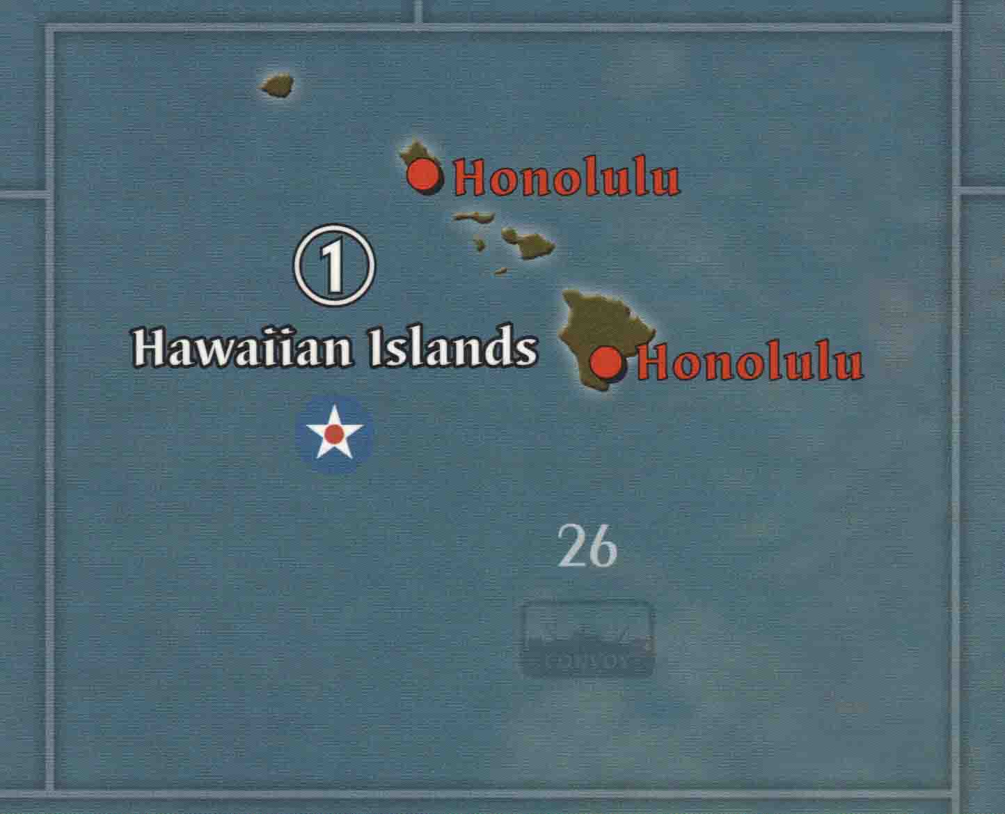
I now have the Pacific map done except for deciding the final color of the ‘convoy’ and ‘kamikaze’ markers. I have some different colors for the convoy markers that I want feedback on. In no particular order, they are in sea zones 63, 20, 62, 54, 37, 43, 36, 10, and 26. I have a couple that I like, but I don’t want to say which because I don’t want to influence anyone else prior to their viewing.
I made two changes: 1.) I corrected the sea zone border with Korea/Amur and 2.) I deleted that 50 ipc marker from the W. US and centered the 10 ipc marker.
Here is the new link, http://www.megaupload.com/?d=ZMRG6UUD
See what you think and let me know.
DaveMarch 7
The map is finished. My wife reminded me that this is copyrighted material so I have contacted Wizards of the Coast for permission to post it here. I am awaiting a response from them. I really hope they allow me to post it. It would be a great addition to the community if I can.
March 25
Well, I finally heard back from Wizards. It was a big fat no. Not even a nice no. After waiting almost one month, after explaining everything I had done and I wanted to do, it was simply this:
"I am sorry that you have had to wait so long for a reply to your question regarding permission to reprint the game boards from Axis and Allies: Europe 1940 and Pacific 1940, and to print and post the map.
Unfortunately, I cannot provide you with that permission. Wizards does not grant permission for these types of use of the Axis and Allies property.
Best regards,
HilaryHilary Ross
Associate Brand Manager
Wizards of the Coast"Boy, nice to know they are watching out for us and they like to interact with their fan base. :-P :-P :-P
So, no one is getting this map from me. Not with a definitive no from Wizards at least. Sorry for getting everyone’s hopes up.
-
map is very dark, need to brighten it up big time
-
Yea, that is something I intend to do. They were all taken at night under less than ideal light. Instead of changing the contrast and brightness on the individual photos, I’m going to wait until they are all stitched together and do it once.
-
First off THANK YOU.
First off your work in Manitoba and Quebec was a welcome sight. As for map corrections I would suggest that you continue to keep the official map clarifications in mind. Such as moving Greenland slightly to the east so that it is more easily identified as an island, fixing the Korea SZ 5 border, and adding the number “128” to the Caspian Sea zone since it is a legal space.
Another task you may want to consider is color correcting the maps. For example The pacific map is a different shade than the eastern europe map which is in turn a different shade than the western europe map.
P.S. Some of the map fold lines are still visible near Portuguese guinea and France, The southwestern Sahara is a bit blurry. I’m sure you already know about these issues but decided to post just in case. And thanks for sharing your EXCELLENT WORK.
-
About the Portuguese Guinea map fold–I don’t know how to get rid of it exactly. The word “Guinea” is in the fold. I’m totally new to Photoshop and as of yet, I don’t have the skill or know how to correct it. I may try manipulating the board so that area looks as normal as possible and then pasting it in later. The whole right side of the map is blurry due to lens distortion from taking the pic relatively close. Other pics that I have with clarity for that area will be stitched together and should take care of that. I am keeping the map changes in mind.
When I get that far I will be adding sz 128 to the Caspian sea and I plan on correcting the sz 5/Korea area. I didn’t know there was a problem with Greenland. I didn’t see Krieghund say anything about that one. I guess I could move it some, but that is way down on my list for now. I had forgotten about the map color differences. I can take care of that too.
Keep up the input. I don’t take as an offense to it as it will help me in my finished product.
Thanks,
Dave -
See my first post. I’ve edited and updated it.
-
Once the map is finished and printed and mounted, it will be great to see a photo of the finished product installed on your wall.
-
See my first post. I’ve edited and updated it.
That is really great quality! I like what you did with the Hawai’i convoy marker too - it really stands out.
Keep up the great work, mate. I can’t wait to see your finished product.
-
Map looks Great!
I’m sure you did it for clarity, I’m not a fan of the bright white sea zone lines. Maybe a lighter blue would contrast enough to show the boundaries. I especially like the bold and brighter convoy boxes.
Again, the map is awesome, thanks for sharing.
Joke: To save time, just go ahead and put a German control marker on London, when the UK starts the game, they can just cover it with one of theirs. :)
-
Thanks for the update.
I fell that the contrast for the new convoy marker is too high. It kinda makes it look out of place. Perhaps add a bit of blue tint to it to make it blend better with the established map style.
Will you be updating WUSA’s ipcs to read “10” instead of “10 / 50”? 10/50 makes no sense since the Pacific FAQ makes it clear that WUSA is never worth 50 IPCs (WUSA = 10 IPCs, USA at war = 40). The 10/50 makes even less sense in Global. Simply put, having both ipcs simply breeds unnecessary confusion.
Again, thanks for your hard work.
-
I had completely forgotten about that 10/50 ipc icon on the W. US. I’ve ignored it since day one. It is now corrected on my map and will be included in future updates. I’ll be looking into updating the “convoy” and “kamikazi” markers so that they are more visible, but not too much so. The color by the one I had in Hawaii was sampled from the sea zone numbers. I’ll see if I can’t try a few different color varieties for the next post and see what people think.
-
See first post for update.
-
Where is the Europe part?
-
@Imperious:
Where is the Europe part?
In the garbage. :-o I didn’t like how the panels were being stitched together so I came at the project a different way and I started on the Pacific side of the board. I still need to do the Europe boards.
-
Once again, awesome, awesome work. I can’t believe how much I can zoom in and still have a clear resolution!
I can’t wait to see the end product.
I have some different colors for the convoy markers that I want feedback on.
Seazone 43 is my personal favourite. It blends well with the sea and stands out without being overly bright
-
Once again it looks great. Thanks for the map fixes.
I believe that ideally the convoy boxes should be the same color as the sea zone border line. However If I had to chose I would prefer a shade thats half way between SZ 43 and 26. 43 is a bit too blue and 26 is a bit bright. perhaps adding a bit of gray to either of these may also do the trick.
In any case your work is greatly appreciated. Thanks for you work. Cant wait to see the rest of the map.
-
I dont know if its possible but if you could move Honolulu off the big island and onto oahu that would be great. Your work in WUSA looked flawless.

-
Yeah, I’ve been to Hawaii (both Oahu and the Big Island) and I wondered why Honolulu was placed on the Big Island. I’ll give it a whirl and see how it looks when I move it.
-
Bob,
I think the reason for putting Honolulu on the Big Island where Hilo is was because it is totally disproportionate to Oahu. Take a look and see what I mean. I can move it easily enough if that is still what you like. To me, both the current placement and the correct one bug me for different reasons.
edit: On second thought, I probably will move it. The VC dot is disproportionately large compared to the size of Oahu, but it does look better to be in the correct position.
-
Bob,
You are pretty good at catching these map anomalies. Can you write a master list for me and post it. I would like to have one place to check for the changes needed.
FYI, it will still be a several weeks before I’m done. Since I’m new to photoshop, every challenge I encounter usually takes me a while to figure out. One thing in particular that I’m having issues with is trying to balance the colors of the Euro maps with the Pacific map panels. Right now that is not going so well.
Suggested Topics

