


@Screamer Yes, it’s possible. The only way the fighters could get out would be through Persia (if not still neutral), as they can’t fly over a neutral territory.
Sculpt Colour Comparison Pictures
-
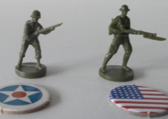
Seventh shot: old Americans (Milton Bradley), new Americans.
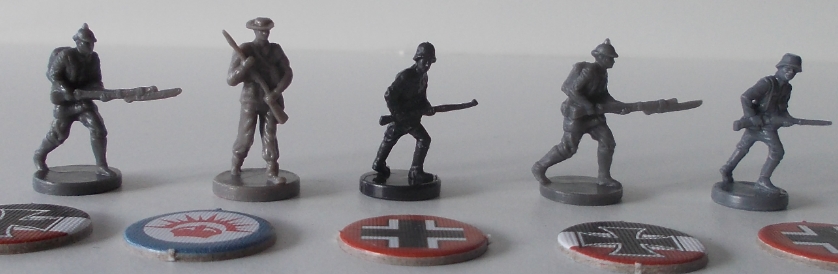
Eight shot: new Germans, old ANZAC (Global 1940 2nd ed), old Germans (Global 1940), new Germans, old Germans (Milton Bradley).
-
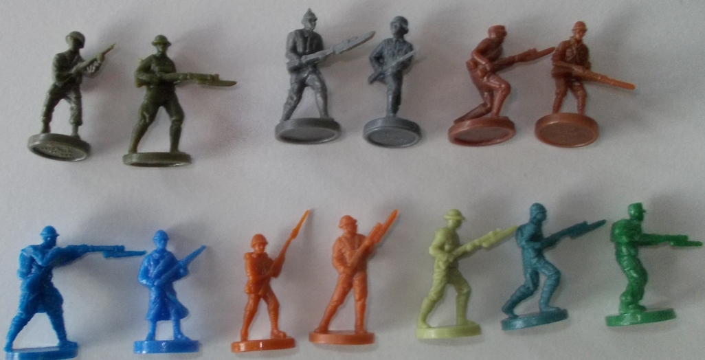
Ninth shot: Combined shot of the closest colour/shade matches. The new Americans come closest to the old Milton Bradley Americans, but are a little more green. The new Germans come closest to the old Milton Bradley Germans, but are a little darker. The new Russians almost exactly match the old Italians. The new French are a little darker than than old French. The new Italians almost exactly match the old Japanese. The new British, plus the Ottomans and Austro-Hungarians, don’t come very close to matching any of the existing shades – even in the case of the lime-green British sculpts, which aren’t the same shade as either the pale green British pieces from Revised or the light green Chinese pieces.
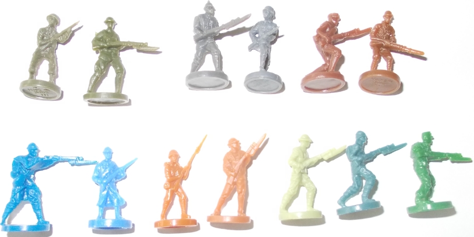
Tenth shot: same as the previous one, but taken with a flash rather than in daylight.
-
New Brits are a strange colour. Sometimes they look cream, sometimes virtually the same as Revised lime; on some photos they look much greener than they really are. But then I’m red-green colour blind…
Incidentally, has anyone else found a variation in the colour of a power’s pieces?
I got two Russian fighters in a much lighter brown than the rest of the set.
-
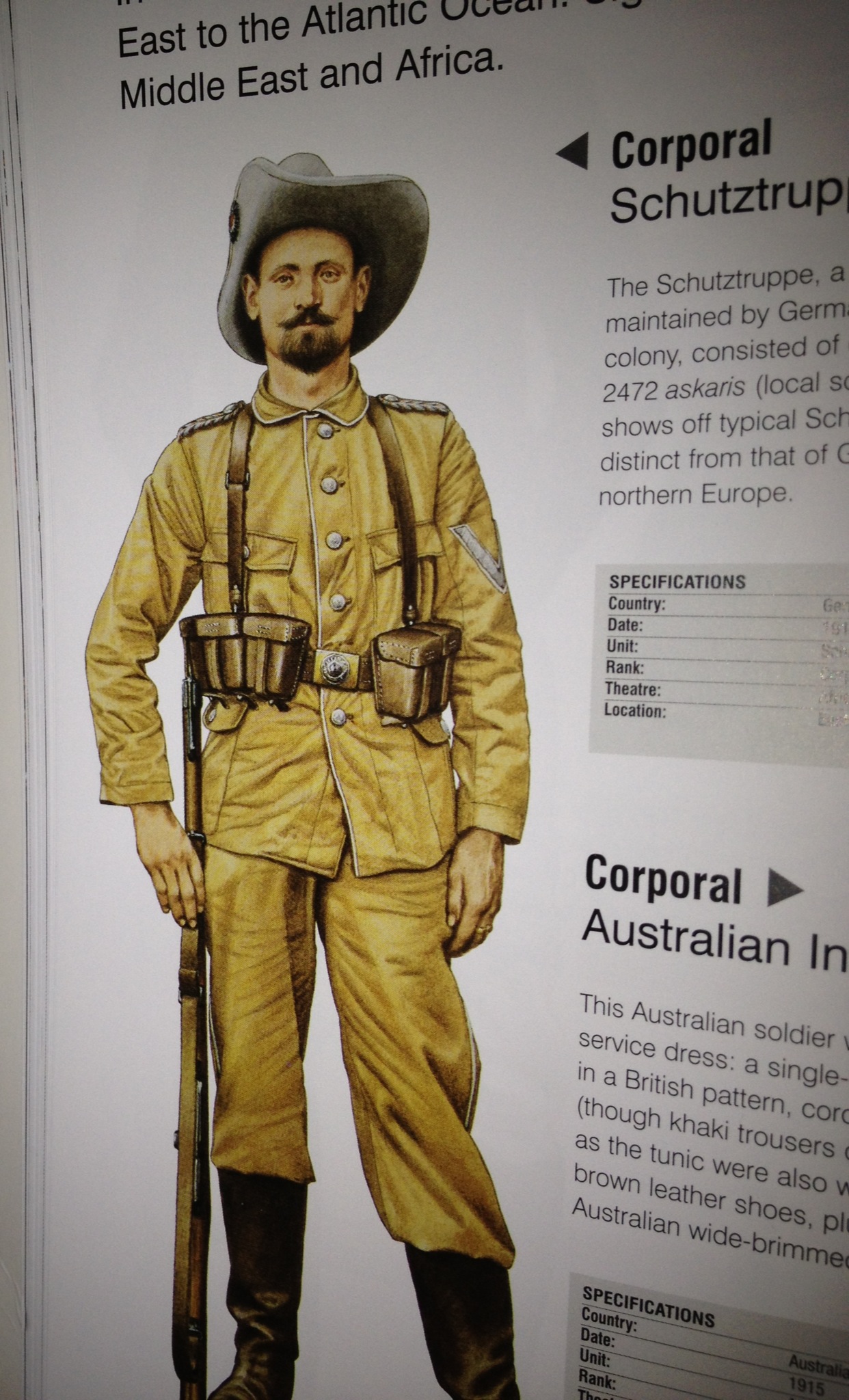
Just realized something Flashman, the 2nd ed. P40 ANZAC infantry would be perfect for German Askaris…here’s a shot of a German African soldier from the Military Uniforms Visual Encyclopedia.
-
Except Askaris were black…
http://www.hat.com/Curr3/Bx8268A/Bx8268A.html
I’m really thinking about native troops here, but yes, the ANZACS would do for German schuttztruppe.
-
When I was comparing the infantry pieces yesterday, I noticed that the new ones have two things in common with the ANZAC troop sculpts from Pacific 1940 2nd edition: they tend to be a bit taller than the previous troop sculpts (though this depends partly on the poses) and the underside of the base is blank rather than stamped with a national identification code. So it looks as if the new ANZAC troop sculpt was the forerunner of a different style of infantry sculpt production (a theory which I think someone speculated about last year when the new ANZAC pieces appeared).
-
Hope so: I’d like to see:
Askaris (a generic African unit, can be used by all powers; or make in different national colours).
Arab irregulars, serving much the same function as Askaris.
British Indian infantry.
Both of these could be used for either World War.
-
Is it just me or do the new WWI sculpts look cartoony? Overall I think they are inferior to the previous A&A sculpts for WWII.
-
Agree. I figure A&A 1914 is a simple game for kids, and G40 is an complex game for adults. Thats why
-
Agree. I figure A&A 1914 is a simple game for kids, and G40 is an complex game for adults. Thats why
G40 may be bigger with more units, but it does not appear that 1914 is simple. It will be tough to plan ahead several turns what to buy and where to attack (Since land units move one space and air only 3). They still cannot figure out many of the rules; there are neutral powers; Russian revolution rules; etc… You want simple- get 1941 or Spring 1942.
-
In that case, what would be your explanation of the cartoony sculpts ?
-
In that case, what would be your explanation of the cartoony sculpts ?
Perhaps to look like propaganda posters of the time? I don’t know I’ll have to get back to you when I get the game (hopefully tomorrow?). Judging from the pictures they don’t look any more cartoony than some of the WWII sculpts. I actually think they are better than could be expected, albeit fewer different sculpts than we wanted.
-
The main quibble I have with the infantry sculpts is that the bayonets look too big, or perhaps too wide relative to their length. It makes for a more solid sculpt (as compared with the bayonet on the Japanese A&A sculpt), but I’m not happy about the appearance.
-
Not cartoony at all IMHO.
Think they look great, better than I expected.
-
Is it only me, but the Brits look - sickly… ;)
I like the Cruiser and sub sculpts, the BB is too basic IMHO, but the transport is great IMHO
Arty is nice, but the Tanks and planes are just right .
The infantry also looks nice - I also think its sort of propaganda poster style…
I think the game has potential nad getting a 2nd edition is simply a must (more units and more of the existing units ;))
-
In that case, what would be your explanation of the cartoony sculpts ?
Who said they looked cartoony? I think they look a lot better than some of the WW2 sculpts. So tired of looking at the same damn Brit units with shorts and tin hats.
-
The quality of the infantry is variable; the USA piece is a 9/10, the Italiano is rather awkward, the gait of the Russians and Austrians is questionable.
But overall they’re fine, certainly don’t think of them as cartoony. What about the sculpts in The Conflict; are they, what, postery? decoesque?
-
I believe that these infantry sculpts are the best in any A and A game yet
-
How about a photo of all the new ones next to each other?
-
How about a photo of all the new ones next to each other?
Yes, I can certainly do that. I’m going to be out of town briefly, so I’ll only be able to take the picture in a day or two.
Suggested Topics

