
Alpha+.2 Setup Charts COMPLETE!
-
Looks very nice! (especially the 2nd one where the photo is put in the background)
some comments:
1. your anzac chart: the capital text + using black horizontal lines make your text difficult to read. I think it would work better without lines, or only lines seperating bold titles and regular text. Maybe even a brownish paper texture as background? Would go well with the top Secret stamp. Will you use diufferent stamps for each nation? (the eagle logo for the germans etc… more work but will look great)2. the technology background pic looks great, although kinda anachronistic. Doesnùt bother me much, but you could consider using a photo from some factory or lab from the 40ies era.
3. the silhouettes of the units next to the names is a good idea, but this way they look messy, maybe you could flag them out in the opposite direction (center to the right i mean) and maybe reduce the empty space between units and the cost column abit.
Hope this was useful
edit: minor detail: “turn sequence” should be “Turn Sequence”
-
Thanks for your comments Special Forces,
1. I have made some adjustments to the font representing the territories, which do you think would look best? The lines on the chart is something i won’t change, it requires a lot more work based on the format that i’m using. I could darken the manilla folder texture just a little, but too much and the letters would get too mixed in. The Nation-specific stamps would be a pretty cool feature and i thought about it, but require searching the web for hours… its just something i’m tired of :cry: though i wouldn’t mind some help :-D then maybe i could add them.
2. The mobo background pic was all i could find that fit the profile, i tried looking for WWII era labs etc… but couldn’t find appropriate ones. Though if you know of any feel free to post =)
3. I might try that, but i likes the messyness :-P but compare the two and let me know which one you like.
EDIT: I was looking through the PNG file and noticed that the Manilla Folder is actually darker on the file than it is on the Screen Shot.
-
@Minor:
Thanks for your comments Special Forces,
1. I have made some adjustments to the font representing the territories, which do you think would look best? The lines on the chart is something i won’t change, it requires a lot more work based on the format that i’m using. I could darken the manilla folder texture just a little, but too much and the letters would get too mixed in. The Nation-specific stamps would be a pretty cool feature and i thought about it, but require searching the web for hours… its just something i’m tired of :cry: though i wouldn’t mind some help :-D then maybe i could add them.
2. The mobo background pic was all i could find that fit the profile, i tried looking for WWII era labs etc… but couldn’t find appropriate ones. Though if you know of any feel free to post =)
3. I might try that, but i likes the messyness :-P but compare the two and let me know which one you like.
1. For a second i thought you were gonna use different fonts per territory :lol:
Personally i like the Malaya font the most. It is clear, simple, and sorta condensed, this way longer territory names easily fit on the card. Queensland font is nice too but the same as the other text, right? But still good.Fair enough about the lines. Would you consider lower case text there?
2. Came across a few pictures a while ago but i didn’t save them. Did have this one, though.

Maybe not ideal for adding text all over itPerhaps some members could chip in in visual material?
3. i like the centered images, because i can find what i am looking for in an instant (you forgot to center the technology die?)
But the centering of the titles (land units, etc) is a bit more to the right than the centering of the pieces, which gives it a sloppy look, i think.
But ok, you didn’t mind messiness? ;) -
Oh my God, I love you
-
Agreed about Malaya font.
Germany:

Japan:

Italy:

Lemme go get the Allies.
-
USA:

UK:

ANZAC:

Russia:

France:

-
Nice work Zallomallo i’ll be using some of those stamp marks. :-)
Here’s an updated build…
EDIT: I did a test print and it came out awesome!

-
@Minor:
Nice work Zallomallo i’ll be using some of those stamp marks. :-)
Here’s an updated build…
EDIT: I did a test print and it came out awesome!
-fancy image-
Looks sexy, love the backrground of the first box. Here are some of my suggestions.
1. Line between National Objectives and Diplomacy(they look too conjoined)
2. Maybe add facility repairs under the tech dice?
(also the Other should be centered, right?)3. Make the 1st turn sequence into one line to make it look nicer. Maybe just Develop Technology, or Develop Weapons or something.
4. Replace that tech image.
5. Make the brown under the NO’s/Diplomacy look more like a battered envelope?
Anyways, great job, these are shaping up real awesome.
-
Oh, and imo it would probably look better to have the AA gun filled with the same silhouette color.
-
new build…

-
Looking good. Nice selection of stamps as well!
Edit: i’m curious, which program did you use?
-
Very sexy :mrgreen:
-
Wow, these do look really great! I love seeing the design progression too. Shows the amount of work and thought that goes into a project like this.
-
That last one looks great
-
@ special forces - thanks =) I used Photoshop CS5 & Illustrator CS5
thanks everyone for the support, I will have these finished by next week.
-
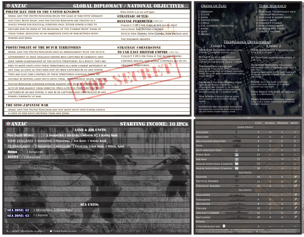
Very nice , just triple check all spelling. I noticed you spelt Whales instead of Wales for New South Wales. Id hate for you to finish then have this 1 tiny flaw in the background. Otherwise excellent work.
-
Looks AWESOME!
Do GERMANY Next!
-
I can’t wait! I’ve been waiting for these! In fact, my brother and I won’t start another game until you finish them :lol: No pressure!
-
*changes
- background color change of Global Diplo & Starting Income
to specific nation color - added bullet belt divider between charts (Vertical)
- fixed some misspelled text
- replaced AA gun with consistent AA gun design
- added nation specific units
- more changes to Unit Reference Chart
I’m about 85% done with these, if you have any suggestions or catch any mistakes please let me know!
thanks! =)
EDIT: I have Germany Setup chart completed, I will reveal that one last >=)
- background color change of Global Diplo & Starting Income
-
Well done


Suggested Topics

