


Thank you both, for helping me out here ;)
Bob_A_Mickelson's AAG40 National Production/Objectives and Setup Charts
-
Update: Sept 29, 2010
Minor update. Fixed a couple of typos and minor formatting changes.You can download the full resolution charts here:
http://www.mediafire.com/?rwp4nvlm1gfm9ctscreenshots
Update: Sept 20, 2010
Uploaded my new clearer font charts. Now with twice the resolution as the previous charts. Also includes AAG40 battleboard. Some corrections made. Thanks to those of you that helped me find the errors. As always let me know if there are any errors.
You can download the full resolution charts here:
http://www.mediafire.com/?46zx1g70xwgtms3[screenshots removed. see updates above.]
Update: August 31, 2010
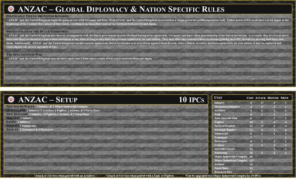
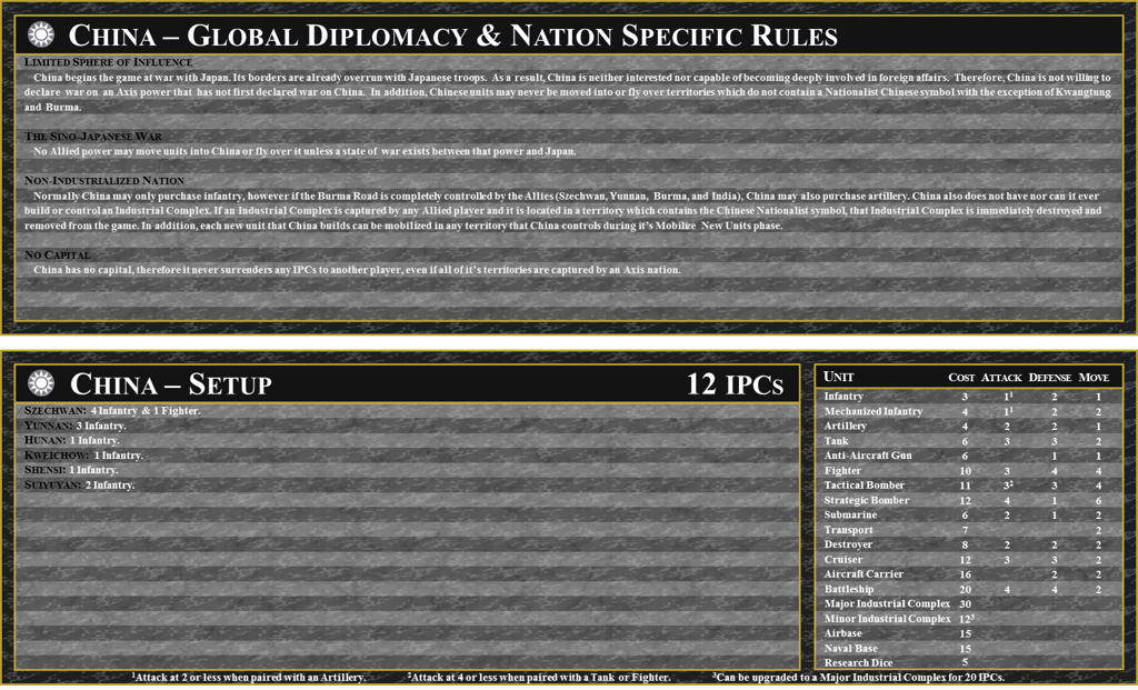
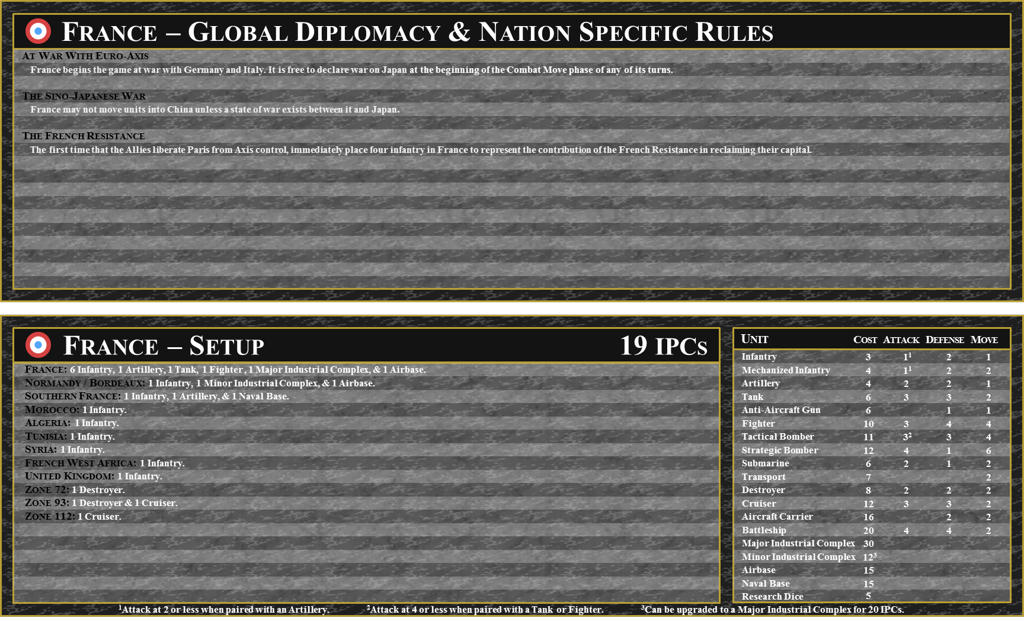
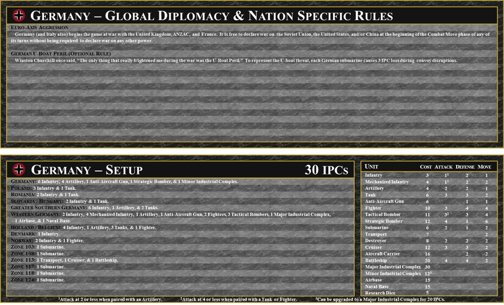
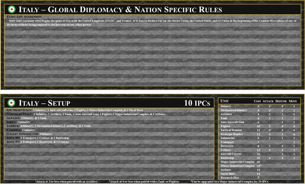
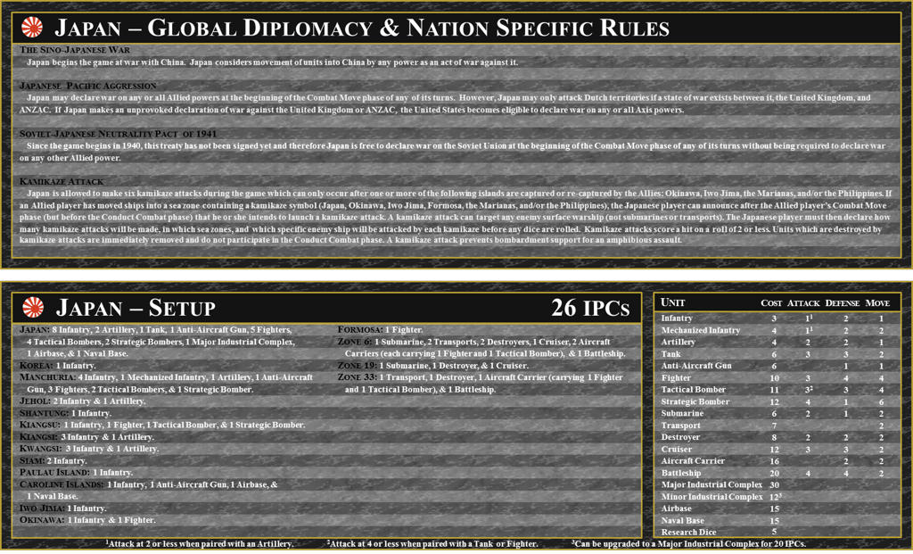
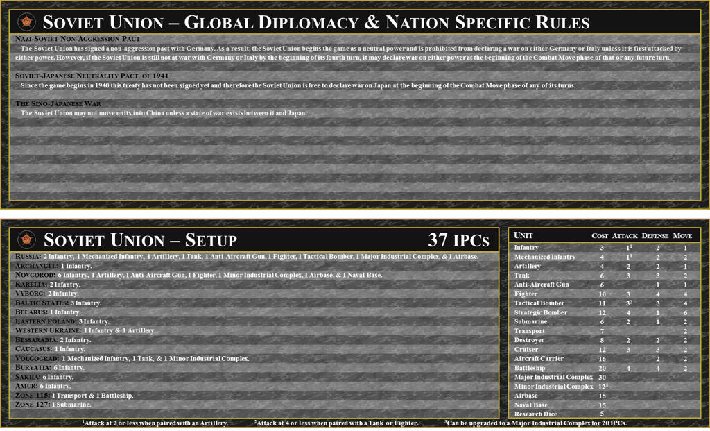
My basic charts for AAG40 are complete. Below you will see the low resolution screenshots of the AAG40’s National Production / National Objectives / Weapon’s Development Chart, Diplomacy / Nation Specific Rules Charts and Setup Charts for each power. As always,please report any errors or inconsistencies so I can fix them. Enjoy.
Download the Full-Resolution version of these charts here:
http://www.mediafire.com/?6e1yyufks954ap7
[screenshots removed. See updates above.]I don’t expect that I will get around to Task Force or Battleboard any time soon as I still have AAE40 Charts to finish plus a potential setup change from Larry Harris.
UPDATE: 8/26/2010
Minor update fixing one Germany NO to be 3 IPCs instead of 5.
[Chart updated. See above]UPDATE: August 22, 2010
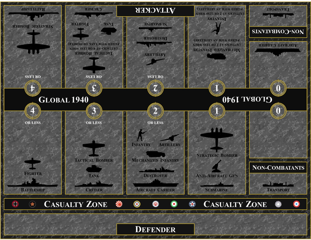
FINISHED AAG40 NATIONAL PRODUCTION/OBJECTIVES/WEAPONS DEVELOPMENT CHART
[Chart updated. See above]UPDATE: August 10, 2010
Here are the low resolution screenshots based on additional information and corrections submitted by those who played the game at Gen-Con.
Thanks for everyone who has helped. As always if you notice any errors or inconsistencies please let me know.P.S. I am already working on the Diplomacy / Nation Specific rules charts. Once again these will be based on information available. An official release will be issued after I read and review the rulebook.
[Charts updated. See above]UPDATE: August 8, 2010
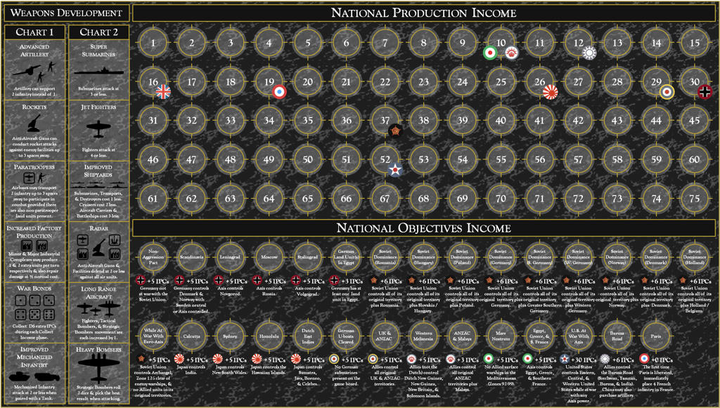
Here is my current version of the AAG40 National Production Chart which also includes National Objectives and Weapon’s Development Charts. Please understand that this is not a final version and changes to the text (which are based on those who have played the game) will most likely change when I finally get a rulebook in hand. This is preview is intended only to be a template for the final version, so don’t freak out if you see something thats not entirely accurate (especially on the weapon’s development chart). This chart will be reviewed, updated, any fixes applied before I post the final high resolution chart. Until then enjoy this low resolution screenshot.
(National Production/National Objectives / Weapons Development Chart has been updated. See above)Original Post: August 5, 2010
Many of you have inquired of me as to when I will begin work on my AAE40 and AAG40 aids. Well work has already begun. So far I have completed the Global setup charts for each nation. There is still much to do on this project and I will continue to work on this project as new information becomes available. Hopefully it won’t be too long before the global National advantages and political rules are known. Until then the wait continues…Enjoy.
[Charts updated. See above]
P.S. Once I complete AAG40’s aids, I will create AAE40 Aids. I will likely also create Canada Aids for those who wish to play it as a separate power.Also any of you notice any errors, please let me know so it can be fixed on the final product.
-
an addational note: can you charpen the numbers beside the attack values(ie the 2 beside the attack for the tac bommer) i say this becaus it looks like a 1
These are the low resolution versions. When I release the complete version they will be much sharper and crystal clear.
ru going to do a politacal sistation? and a NO chart?
The complete set of aids will included both National Objectives and Diplomacy/Nation Specific rules (what you call ‘the political situation’) as well as a few other aids. However I cannot begin working on those aids until I get access to a rule book, which won’t be for some time.
-
Bob… Your service to the community is so greatly appreciated.
Thank you and WELL DONE!
-
Errata corrige:
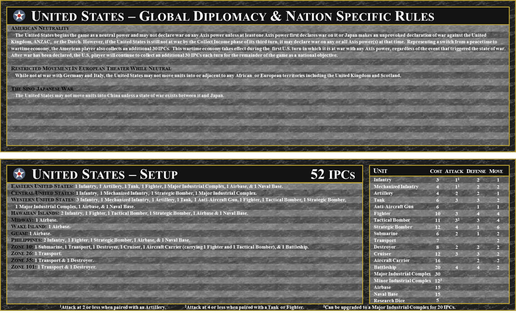
Central Usa no naval and air base
Normandy: naval base no air base.
Est Usa: + 1 AA
French destroyer sea zone 72 no 73 -
UPDATE: August 8, 2010
Here is my current version of the AAG40 National Production Chart which also includes National Objectives and Weapon’s Development Charts. Please understand that this is not a final version and changes to the text (which are based on those who have played the game) will most likely change when I finally get a rulebook in hand. This is preview is intended only to be a template for the final version, so don’t freak out if you see something thats not entirely accurate (especially on the weapon’s development chart). This chart will be reviewed, updated, any fixes applied before I post the final high resolution chart. Until then enjoy this low resolution screenshot.
[National Production/National Objective/Weapon’s Development Chart has been updated. See first thread entry.] -
Brilliant!
Though, my gut is telling me that the income chart will need to be a bit higher than 75 ipcs. But then again, since the American ipc increase is actually a national objective, it could indeed all work out.
-
You need to get a Legion of Honor, Bob.
-
Plus I hope there are other NOs for some of the countries besides Germany and the Soviets… :-P
-
Brilliant!
Though, my gut is telling me that the income chart will need to be a bit higher than 75 ipcs. But then again, since the American ipc increase is actually a national objective, it could indeed all work out.
I understand you point of view. Unfortunately the chart is already 9 1/2" by 16 3/4" (slightly bigger than the old AAP income chart) and I’m not sure I am willing to make it any bigger. I would prefer the chart going to 100 but its already pretty massive. My current line of thought follows krieg’s where the National Production Chart is only for national production IPCs only. The National Objectives chart will track bonus IPCs separately.
I am open to suggestions.
@SAS:
Plus I hope there are other NOs for some of the countries besides Germany and the Soviets… :-P
I hope so too. I suspect some were probably forgotten. When we have an official list i’ll modify the chart to reflect any changes necessary.
-
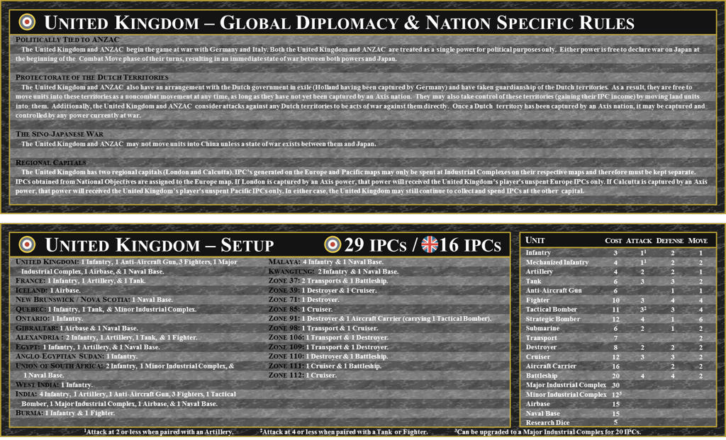
For complete clarity, the starting UK setup board should show two seperate incomes, not a single income, should it not? Or two setup boards? While the total may be 45, it can never be spent as that sum and the specific starting totals seem more appropriate if you use these with people who have never played.
-
For complete clarity, the starting UK setup board should show two seperate incomes, not a single income, should it not? Or two setup boards? While the total may be 45, it can never be spent as that sum and the specific starting totals seem more appropriate if you use these with people who have never played.
You are correct. This update is on the “to do list”.
the union jack is for pacific and the other is for europe. Correct?
bob… what size of paper is this for?
The Union Jack is for UK pacific. This can be changed if the rulebook states the roundels are meant to be used the other way around.
Common paper sizes for printing Global National Production Chart.
American Photo Paper sizes - use S11R (11" x 17") or S12R (12" x 17").
American Standard Paper sizes - use Ledger (17" x 11")or Tabloid paper (11" x 12").
ISO Series Paper sizes - use A3 (11.7" x 16.5" - need to print image at 98%), B3 (13.9" x 19.7"), or (12.8" x 18.0") -
Thank you in advance for the updated versions for AAG40 these charts and aids are excellent work. I love using the ones you made for AAP40 and everyone always asks me where I got them. Thanks again and keep up the great service you provide to the AA fan base.
-
I understand you point of view. Unfortunately the chart is already 9 1/2" by 16 3/4" (slightly bigger than the old AAP income chart) and I’m not sure I am willing to make it any bigger. I would prefer the chart going to 100 but its already pretty massive.
I am open to suggestions.
Well here’s what I was thinking, your current chart is 5 roundels deep by 15 roundels wide, funcioneta suggested on another thread that doing a chart with a section for 1s and 10s would save space so why not start by setting the chart up like this:
0 5 10 60
1 6 20 70
2 7 30 80
3 8 40 90
4 9 50 100We already know that Europe comes with two Union Jack roundels for UK Pacific, so you would just put one on the 10 and one on the 6 and you’ve got the UK Pacific income.
However, this tiny chart would get really crowded with 10 powers (counting UK Europe and UK Pacific as separate since they are on the income chart) with 2 roundels each on the board, plus we’ve only used 4 of the 15 columns you currently have, so we could potentially even have 3 of these charts: one for the 3 Axis powers (Germany, Italy, Japan), one for the 3 major Allied powers (USSR, UK Europe, USA), and one for the 4 minor Allied powers (UK Pacific, ANZAC, China, France).
The last chart for the minor powers could even only include 0-9 and 10 and 20, since one of these powers would have to get really lucky to be earning more than 30 in a game. This would leave plenty of room for extra NOs and such. 8-)
-
These look great!
We didnt play with techs at GenCon, but I do remmeber reading the tech rules. Long Range aircraft only increases range by 1. And with heavy bombers you pick the better of two dice. Its seems much more balanced now.
-
@SAS:
I understand you point of view. Unfortunately the chart is already 9 1/2" by 16 3/4" (slightly bigger than the old AAP income chart) and I’m not sure I am willing to make it any bigger. I would prefer the chart going to 100 but its already pretty massive.
I am open to suggestions.
Well here’s what I was thinking, your current chart is 5 roundels deep by 15 roundels wide, funcioneta suggested on another thread that doing a chart with a section for 1s and 10s would save space so why not start by setting the chart up like this:
0 5 10 60
1 6 20 70
2 7 30 80
3 8 40 90
4 9 50 100We already know that Europe comes with two Union Jack roundels for UK Pacific, so you would just put one on the 10 and one on the 6 and you’ve got the UK Pacific income.
However, this tiny chart would get really crowded with 10 powers (counting UK Europe and UK Pacific as separate since they are on the income chart) with 2 roundels each on the board, plus we’ve only used 4 of the 15 columns you currently have, so we could potentially even have 3 of these charts: one for the 3 Axis powers (Germany, Italy, Japan), one for the 3 major Allied powers (USSR, UK Europe, USA), and one for the 4 minor Allied powers (UK Pacific, ANZAC, China, France).
The last chart for the minor powers could even only include 0-9 and 10 and 20, since one of these powers would have to get really lucky to be earning more than 30 in a game. This would leave plenty of room for extra NOs and such. 8-)
I disagree. With so few numbers, a lot of powers would be on top of each other, which is always annoying to me when changing income and such.
-
@The:
I disagree. With so few numbers, a lot of powers would be on top of each other, which is always annoying to me when changing income and such.
Which is why I suggest using 3 charts. Though I suppose the minor powers chart would have all 4 of them having 1 roundel on the 10 space. :| However, you still have powers overlapping with a typical chart anyway. You could always group the powers differently so as to avoid extra overlap. Such as Axis (Germany, Italy, Japan), Allies 1 (UKE, UKP, USA, France), and Allies 2 (USSR, China, ANZAC). That way you would only have at most 2 minor powers that would have the likely possibility of overlapping, plus each chart has a power that is likely to go below 10 relatively quickly (France and China) decreasing the amount of overlap further.
Perhaps this makes it overly complicated, but it’s what I came up with for making the chart go to 100 without increasing the size.
Alternately it could be 4 rows with 5 columns each, 3 charts. Then it would be the same width as previously, but you gain a row for NOs.
Axis Allies 1 Allies 2
0 4 8 30 70 0 4 8 30 70 0 4 8 30 70
1 5 9 40 80 1 5 9 40 80 1 5 9 40 80
2 6 10 50 90 2 6 10 50 90 2 6 10 50 90
3 7 20 60 100 3 7 20 60 100 3 7 20 60 100 -
I suppose that would work, although my stubbornness says keep it the same.
-
Hey, I kinda like having individual numbers too, but it certainly does take up a lot of space on a card (or the board ala Spring 1942). Besides, it’s just a suggestion; it’s all up to Bob.
I’m also not sure of the actual value of taking up so much space having a separate roundel space for each German territory the Soviets might get an NO for, it seems to me that it’s probable that they won’t get more than one or two boosts from that NO toward the end of the game (if at all if Japan decides to harrass them in Siberia); though again we run into how to mark each instance on the board… :|
-
@SAS:
@The:
I disagree. With so few numbers, a lot of powers would be on top of each other, which is always annoying to me when changing income and such.
Which is why I suggest using 3 charts. Though I suppose the minor powers chart would have all 4 of them having 1 roundel on the 10 space. :| However, you still have powers overlapping with a typical chart anyway. You could always group the powers differently so as to avoid extra overlap. Such as Axis (Germany, Italy, Japan), Allies 1 (UKE, UKP, USA, France), and Allies 2 (USSR, China, ANZAC). That way you would only have at most 2 minor powers that would have the likely possibility of overlapping, plus each chart has a power that is likely to go below 10 relatively quickly (France and China) decreasing the amount of overlap further.
Perhaps this makes it overly complicated, but it’s what I came up with for making the chart go to 100 without increasing the size.
Alternately it could be 4 rows with 5 columns each, 3 charts. Then it would be the same width as previously, but you gain a row for NOs.
Axis Allies 1 Allies 2
0 4 8 30 70 0 4 8 30 70 0 4 8 30 70
1 5 9 40 80 1 5 9 40 80 1 5 9 40 80
2 6 10 50 90 2 6 10 50 90 2 6 10 50 90
3 7 20 60 100 3 7 20 60 100 3 7 20 60 100Interesting idea. but I think the group consensus is to stay with the current style. So no radical changes today. Great idea though.
Long Range aircraft only increases range by 1. And with heavy bombers you pick the better of two dice. Its seems much more balanced now.
My home version has been updated.
Do you know the the Increased factory production rules? My current version is just a guess.
Is Jet fighters correct? -
UPDATE: August 10, 2010
Here are the low resolution screenshots based on additional information and corrections submitted by those who played the game at Gen-Con.
Thanks for everyone who has helped. As always if you notice any errors or inconsistencies please let me know.P.S. I am already working on the Diplomacy / Nation Specific rules charts. Once again these will be based on information available. An official release will be issued after I read and review the rulebook.
[Charts have been updated. See first thread entry.]
Suggested Topics

