
Thank you for sending the map to my printer. I have been testing scenarios out with my A&A using my 1942 second edition. I just have been using sticky note paper to mark my Italian territories. I used the game pieces from my anniversary addition for the Italian pieces. I also added have tracks: cost is IPC 5. Attack 2, defend 2 as tanks cost 6 IPC in this version. Its nice to spend 5 IPC on an actual unit other than an AA gun. No artillery bonus on half track in this version
I also added the recruitment center from zombies.
Please see the chart below
MOBILIZATION ZONE
UNIT STATS COST MOVE ATTACK DEFENSE
LAND UNITS
INFANTRY 3 1 1 2
ARTILLERY 4 1 2 2
HALF TRACK 5 2 2 2
TANK 6 2 3 3
ANTIAIRCRAFT ARTILLERY 5 1 0 1
RECRUITMENT CENTER 10 0 0 0
INDUSTRIAL COMPLEX 15 0 0 0
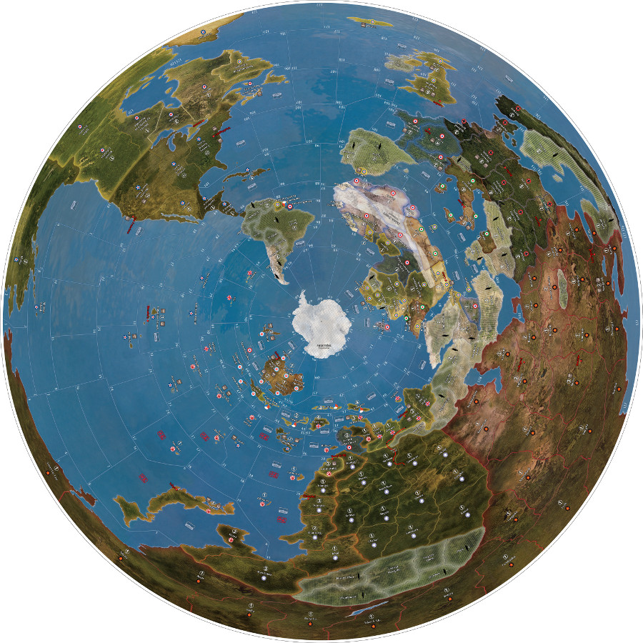
Azimuthal Equidistant G40 map
-
I would appreciate it if someone could double check for errors the G40 round map I made. I hope the initial view doesn’t freak anyone out.
Download larger map
24 inch (much easier to rotate and view)
http://www.mediafire.com/file/3oej7kq96pq35kc/AE+G40+24+inch+Ver+1.00.pdf60 inch
http://www.mediafire.com/file/ap78282ax5xbnik/AE+G40+60+inch+Ver+1.00.pdfYou can resize this to any dimension you want pretty easily. The original is at 300 dpi.
I started with the concept of an Azimuthal Equidistant Projection. These are mainly used by HAM radio operators. That is why you see the distortion as you get to the arctic circle at the perimeter of the map. The arctic circle is just as distorted on the standard map but that projection is what your accustomed to seeing.
Sea spaces 10 11 and 64 are not well defined as to where they connect to Mexico on the standard map. Any opinions on this would be appreciated. I also moved England to make the channel bigger. I did do some tweaking based on what others had done with their maps.
I had tried to do a North pole perspective but the European continent is just too small for game purposes. I tried projections where the continents are more in a normal perspective but about 70 percent of the map is water. Looks good but not useful for game purposes.
If you wrap the two sides of the standard map, the North American continent does not match up well. The West coast is much smaller in scale to the East coast. You don’t notice this as they are so far apart on the standard map. I also had to fill in some space that doesn’t appear on the standard map Central US and Canada and Mexico.
This mismatch on the North American continent caused me to crush some of the sea spaces and stretch others. 28 is much smaller and 11 is heavily distorted. But to keep the spaces connected as per the game rules I had no choice. Alaska is really stretched.
I stretched the northern latitudes north and south to make them bigger then normal for more game space. This moved the southern latitudes closer to the south pole and you can see space is squeezed on southern Africa and Australia.
I am short on space at home and thought a round map would be the most compact. I have a 60 inch round fold up table. I am going to mount the map on a lazy susan turntable so the players can easily rotate the map. I am going to mount an acrylic center post with a couple of staggered 8 and 12 inch acrylic discs in the center of the map to put the income and turn trackers on. With water slide decals the should be pretty see through and not block the view of the map.
If you print this map at 54 inches you have the same amount of “real estate” as a 72 x 32 standard map. I originally was shooting for 48 inches in diameter that could fit on a standard card table without too much overlap. This would be 10 percent smaller then the standard map but you could easily mount it on a 48 x 48 press board panel they sell at hardware stores.
I am going to make a 60 inch disc by using two 48 x 96 1/8 inch press board panels. If you cut them at 5 feet (60 inches) and the move the 3 ft panel to the side you can draw a 60 inch circle. After cutting, laminate the four pieces together (moving the smaller pieces to different sides) to get a solid 1/4 inch disc. I am going to cover this with felt and use it for other games as well. I have a local sign maker that can print up to 64 inches that I will get my final map printed at.
When I finish my table I will take some pics if anyone is interested.
I have a posterized a file so that you can print this map on your home printer or take the files to a print shop and have them printed on standard 8.5 x 11 sheets. It is about 56 sheets to make the map but should be much cheaper then a sign shop printing one gigantic map if your tight for funds.
http://www.mediafire.com/file/pgzbhdf16xawndg/EA+G40+60+inch+.25+inch+overlap+posterized.zip
If anyone wants to play around with the unmerged graphic files you can download it here.
http://www.mediafire.com/file/ywge2mvbch4dbxw/AE_G40_South_Pole_Ver_1_.xcf/file
Designed in Gimp 2.8
Fonts: BarbedorEF for text and numbers
Ariel Bold for some numbersAny feed back would be appreciated if you find the map interesting please feel free to use it.
cdemaris
-
The map certainly looks beautiful – it’s one of the most attractive variations of the Global 1940 map I’ve ever seen – but as you indicate in your post there are potential playability factors to consider.
You’ve already identified and compensated for some of the space problems that other projections would have caused, and you’ve said that the present version gives the same amount of real estate as a 72 x 32 standard map when printed at 54 inches. I’m interpreting this to mean the same amount of total land area as the rectangular map, but I’m wondering if this also applies to the area of individual labeled land territories. A substantially smaller area wouldn’t be a problem for the areas of the game map that rarely see much action, but it could lead to substantial sculpt crowding in the territories in which huge forces tend to pile up and fight each other. The normal A&A maps, after all, tend to distort size and shape in a way which sacrifices realism in order to gain “working space” for the major WWII zones of operation; a good example is North Africa, which a typical A&A map shows as being disproportionately large compared to the southern half of the continent.
You mentioned that you “tried to do a North pole perspective but the European continent is just too small for game purposes”. This is very puzzling because I would have thought the opposite. Then again (because I don’t know much about the technicalities of map projections), I may be being fooled by the shape-distortion aspect rather than the size aspect. The projection you’re using seems to have the least shape distortion in the middle and the most shape distortion at the outer edges, and I would have concluded from this that a northern polar projection would be preferable to a southern one because most of the world’s land masses are in the northern hemisphere (all of North America and Europe, most of Asia and Africa, and a good piece of South America), which means that the best candidate for maximum distortion at the edges of the map would theoretically be Antarctica (which doesn’t get used in the game) rather than Europe and North America and the USSR. But given that I haven’t seen what the northern polar projection you tried looked like, I’m simply speculating that in principle it ought to have worked well; in practice, it may have proved unworkable for reasons I’m not visualizing.
-
Thanks for the response!
The area of a 72x32 map is 2304
The area of a 54 inch circle is 2290-14
This is just total map space. The individual territories would vary due to distance from the poles.
This projection is like taking a globe turning it upside down and smashing it flat. The closer you are to the north pole the more you get pushed out towards the perimeter.
This is a North Pole perspective you will notice Antarctica is smeared all around the outer edge.

You will also notice most of the map is water. To enlarge the northern continents for game play I had to make the North pole a massive area that took up too much of the map. My other self imposed limitation was sticking with the original artwork as much as possible.
I am going to retry a North pole perspective as I learned a lot making this one.
I just thought the south pole perspective would move more of the game playing to the outer edge of the map and be more useful. It does take some getting used to looking at it.
Demaris
-
Thanks for posting a picture of the northern polar version of the map and providing the additional background information. I think the northern version has good potential to be developed into something that could work quite well. I’ll get to the specifics in a moment, but first I’ll run through the decision hierarchy which I think is involved here. The highest-level choice is of course the decision to go with a circular map rather than the conventional rectangular shape (or possibly some of the other broad types of map projections which exist, such as the ones which are oval or losenge-shaped). A circular A&A map isn’t personally something I’d use for gaming, but that’s just a personal preference – and as a Global 1940 map customizer myself, I totally see the point of wanting to do something imaginative to improve the OOB game board. With a circular projection having been chosen in a general sense, the next decision becomes which specific circular projection to use, since there are several types, azimuthal equidistant being just one of them. Choosing azimuthal equidistant then leads to the decision of which particular view to use: north polar, south polar, equatorial or oblique. The equatorial or oblique views strike me as the least suitable options for A&A gaming purposes, by a wide margin, which leave a choice between the two polar views – which is actually where we are in this discussion.
As your new picture shows, the northern polar view gives the following cost/benefit trade-off. The cost that it more or less throws Antarctica under the bus; this is actually a pretty trivial cost because Antarctica isn’t a usable territory in A&A, so you’re not losing anything (other than perhaps the potential for some house-ruled secret Nazi bases) by turning it into some white squiggles around the perimeter of the map. The benefit is that it gives (compared with the southern polar view) the most square footage and the least shape distortion to the northern hemisphere, where most of the world’s land mass is located and where most of the land-based action of WWII was fought. As a basic choice, this strikes me as being optimal.
What would remain at this point would be the issue of adjusting the details of the northern polar view to make its land and sea subdivisions as usable as possible as a physical A&A game map on which sculpts and territory markers and so forth can be deployed in adequate numbers. As is the case with the rectangular OOB map, this will – regretably but unavoidably – involve making selective size and shape distortions. China on the OOB Global 1940 map is a good example of what I’m referring to: compared with how China really looks on a real map, the A&A version is a fair approximation in terms of shape, but in terms of size it’s extremely compressed in the east-to-west direction relative to its north-to-south size. For your northern polar map, I think the first element you should target for adjustment is the problem you’ve mentioned yourself: the fact that most of the map is water. In real-world terms, the Pacific Ocean carries much of the blame: I think it occupies about one-third of the world’s surface. The Global 1940 map massively shrinks the Pacific Ocean, and even cuts out sections of it entirely (notably the huge area between Samoa and South America). So what you may want to do is measure the surface area allocated to each ocean on the Global 1940 map relative to the total land area, then replicate the same size ratios on your northen polar projection. That by itself may give you more than enough room to expand the land areas to a conveniently usable size.
-
You make some good points.
North or south pole are not used in AA. I put the off limits diagonal lines on Antarctica and (Impassable) just as it is on the Sahara Desert. The same would have to be done with the Northern Pole regions. Instead of a big white circle I just plugged in the actual continent for aesthetics. Your right it could be house ruled for secret Nazi bases that the US did search for in the late 40’s. Admiral Byrds Operation Highjump. There is a 1950’s television interview of Byrd out there on youtube that is quite astounding as to what he found down there.
The main problem I ran into with the Northern view was game play-ability. Northern Europe gets crushed as it is so near the pole. The easy solution is to expand the pole to move everything away from the center. But then “if” you are trying to save space, as I was, you run into some trade offs. If your off limits North Pole region gets much bigger then say 12 inches on a 48 inch map your giving up a lot of real estate. The water areas get disproportionately shrunk as well. Much of the game is water based.
I am going to go back and attempt it again. I don’t know if you have ever seen a Galls-Peters projection.

I think if I can morph the AA land masses into something close to that and then do a polar spin on it it would give me a starting point to work with. The AA map is my other limitation I want it to “look” like the original. The same graphics and textures.
Using your idea of measuring the percentage of land vs sea is a good idea. I could probably just through a 1 inch square grid over the standard map and then mark the sea grids. Count them up and I would have my percentage.
-
One note: that I think Grass Hopper mentioned this in a post. This map is copyrighted by Axis and Allies. It isn’t mine, that is why I offered this freely on here. I spun the text around and morphed the land masses which was a lot of work but I enjoyed doing it. I don’t think I crossed any lines. Throwing a copyright on a modification and selling it would probably get you a legal phone call. This map is useless without owning the game.
Does anyone have contact with the publishers and have them express their views on all these maps?
-
 L Lompestein referenced this topic on
-
Thx man, that’s a fine piece of work. I’m intrigued with this map.
Also thanks fot sharing the .xcf file. (more people should do that) I felt free to play around with it and add some more layers for beter control of the colors and display of the final output image.
I will print it and check how the playing experience is. When that’s ok, maybe I will add some overlays in it, see also my customized map for global: https://www.axisandallies.org/forums/topic/40086/jj-s-axis-allies-global-detailed-map-file-for-large-scale-printingHave you printed and play with it yourself?
Another question; how did you transform the map in GIMP?
Here is were I share all the files:
[Download][link text]((https://drive.google.com/drive/folders/1qGlOXyLRZ3u1aW7G4wFaux3P8IeZIlkm?usp=sharing)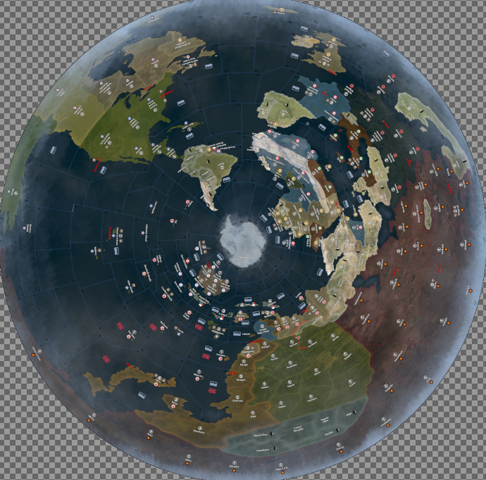
-
@Lompestein If we can makes these rotate, they could be a gif for a profile picture? Other than that i don’t see much value in the conquest of Antartica
-
@Imperious-Leader The center of the map (Antartica) could maybe also used for additional gameboards etc. But to be honest, I will first proof the board when printed. Not sure if I will get dizzy when playing with it…😉
-
@Imperious-Leader I put Antarctica there instead of a white circle. I also thought somebody could use it for secret nazi bases rumored to have been there. I mounted the board on a lazy susan so you can spin it, (slowly).
-
Lompestein, thanks for the complements, pretty much everybody else was underwhelmed. I mounted a 5 ft version on press board I cut into a circle and mounted on a lazy susan so you could spin it. Played twice on it but the guys I played with were interested in the regular maps.
I made this after injuring my leg at work and was immobile for a while. It took a long time, about a couple of months of daily tinkering. I enjoyed it, kept me busy.
What I had to do was cut the map into about 16 to 20 horizontal strips. I didn’t keep the original files they died with an old computer I used. I used the polar function in gimp under distorts to spin the map into a circle.
I would then individually stretch vertically the strips to account for distortions at the outer and inner extremes. Spin unspin adjust, spin unspin adjust.
All the graphics had to be erased before doing this.
Repair all the borders. I also had to tweak individual land masses and continents by cutting them out and pasting them on new clear layers stretch and pull trial and error.
I believe the xcf file still has the graphics on a transparent layer over the map.
Feel free to do whatever you want to it and send me a pic of your results.
My motivation was the Gleason New Standard Map of 1892
https://www.amazon.com/Flat-Earth-Map-Gleasons-Rowbotham/dp/B01GQUW6PO?th=1There was also a similar map used in WW 2 for people to track the progress of the war at home.
Suggested Topics

