

I have been playing around with different configurations for a custom table and wanted to note some things I’ve landed on that I really like. A main one thing is having the map mounted so that it can slide around as needed on top of a bigger playing area. My table is 65” x 95” in total with a 5.5” arm rest around the outside and the middle is a recessed neoprene surface. I have the OOB Global map mounted on 1/2” rigid foam with a 1/2” aluminum frame around it. This allows the map to slide up close to whoever’s turn it is, but then be in the middle so both players can roll dice In front of them without disturbing the map and in easy view of the other player. (Plus we like lots of room to roll the bones). This ability to adjust the surface along with a standing height, makes it comfortable for long uses because you can move around more and don’t feel as tied down.
Things I’ve learned and changed from original design - I originally used too big of a frame for the map and mounted it on too high of a foam block (you can see these pictures at the bottom) - it made it hard to see the other player’s dice and the big frame took up too much real estate. My global map is mounted on much thinner foam (the framing is bad, you can see if you look closely) but I also used much thinner aluminum angle for the frame. This gives just enough grip when needing to move the map around (I use furniture slides on the bottom, which glide very nicely on the neoprene) but doesn’t make the whole thing too bulky. Having it an inch or so off the surface keeps the dice off, but isn’t so heigh that you can’t see the other player’s dice rolls. When playing other versions (such as Zombies) the board is much smaller, but it can easily swap in and out on the same table since it can move around where ever it is needed or be pushed aside.
I originally made it normal table height, but found long reaches while sitting were harder and it just felt cramped. Standing height with a bar stool is a great way to have the best of both worlds.
The 5.5” rim around the table itself gives you a nice arm rest that doesn’t interfere with the gaming surface. I’m playing with how to best add some cushion to this part - open to suggestions. Sometimes I just lay a piece of leftover neoprene on it.
Dice bounce nice on the neoprene and stay off the floor. It also feels nice and has enough give to allow things to slide but be picked up easily. Wouldn’t definitely go with neoprene again as a surface covering.
I made the drawers open to the inside of the table so you can stay hunched over the action while accessing and stowing stuff away. 50/50 on whether I would keep this if I were to do it again. If I were doing it again, I might try to build customer drawers form scratch using actual drawer glides, but that was beyond my ability when I first did this, so I just used clear plexiglass boxes with aluminum pulls mounted on them. It’s nice having them clear, and I was happy with how the pulls came out, but without glides they can be a little fussy sliding in and out of their slots.
I originally designed the table so that I could put a cover surface back on top when not in use, but find I don’t really ever do that, so if I were to do it again, I might not mess with that part (I never even finished staining those as you can see in the pictures).
CF362D52-269F-4480-8CBB-08139099138F.jpeg A9E12EA1-66EB-4671-86AC-68C62FD30AD5.jpeg 858DE1F2-030A-4D5A-93E4-70A7D1180ADB.jpeg 8F513EE0-DA37-4BA9-880E-4D5EF7BF431F.jpeg F0188165-757B-4CC1-BF67-5045832283C9.jpeg 2E3CD627-0D31-4121-ACF8-682F9F58A40B.jpeg
Tjoek's 1940 Global Map file and setup charts (Updated May 30th 2018)
-
Ya their islands are terrible, if you look you’ll find almost all of them are wrong…. one of the ones they managed to get right, they put it upside down lol.
-
Ya their islands are terrible, if you look you’ll find almost all of them are wrong…. one of the ones they managed to get right, they put it upside down lol.
I personally don’t mind some free hand approximations but putting Atlantis between Celebes and Dutch New Guinea is a bit to much. Although with Zombies coming to AA… :-P
-
When do you expect this map to be done? Also, would you be okay with me taking it to use for my custom map? I mainly will be changing territories and values (as you can see in the progress I had made). I am asking since I will be changing programs and will likely have to restart. So I figure I might as well restart with a well done map. However, if this will take a few more months I will likely continue to use IE’s map
-
Your work is very nice ! it’s the little details that make the difference !
-
When do you expect this map to be done? Also, would you be okay with me taking it to use for my custom map? I mainly will be changing territories and values (as you can see in the progress I had made). I am asking since I will be changing programs and will likely have to restart. So I figure I might as well restart with a well done map. However, if this will take a few more months I will likely continue to use IE’s map
I expect to finish this map second half of April. Shouldn’t take to long anymore.
And I will post a few versions of my map on the forums so feel free to reuse it for you purpose. I would love to see the fruit of my time and effort be used by other enthusiasts within this community.
-
Your work is very nice ! it’s the little details that make the difference !
Thanks! The downside of attention for details is that it takes time and time and even more time, but I like it!
-
I’ve been working on my Anniversary map file the last 2 weeks, but will continue the work on the Global 1940 file as of right now.
I’ve finished the color corrections on the oceans and I’m currently re-centering country names of mainly neutral territories of which I’ve removed the standing army icons. Stay tuned for some pictures in the coming days.
-
Just a quick update to show you guys what I’m currently doing with re-centering the country names:
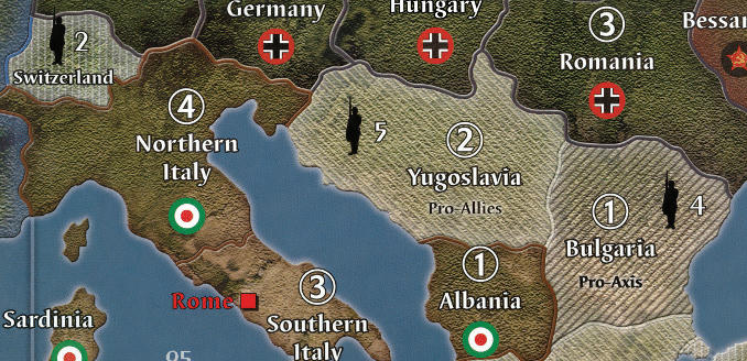
Looking at the image I actually think Italy has been moved a bit to far to the left.
-
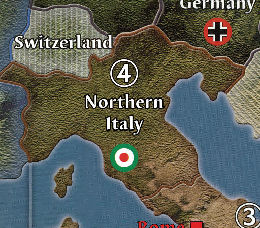
I like the moved Northern Italy. The number 4 could be nudged right a bit as it doesn’t quite look centred on the text.
The roundel I would leave in its original position. I don’t believe in keeping everything centred at the cost of the overall look. -
Looks great! Yeah, moving the northern Italy a tad more back to the right would be perfect. The ‘4’ looks fine to me
-
Thanks for the feedback!
I’ve moved the text for Northern Italy a bit more to the top right (giving the italian roundel some more distance from the beaches :-)) and double checked the positioning of the 4. This was only 1 pixel off so I fixed that to, but this small difference is not be visible on the previous image so it most likely is some optical illusion close to the Swiss border.
To me this looks way better now:
-
That looks great. My eyes aren’t sensitive enough to pick up a 1 pixel difference… haha :-D
-
could be an optical rather than a physical imbalance with the 4.
The tension points between the end of northern and the top of the 4 could be doing it.
I’ve often altered/uncentred designs because of this effect. For some, its like fingers on a chalk board. :-Dafter importing it into Illustrator, I found the 4 is off. It is too far right within the circle. This is what is throwing me off.
-
A pixel off within the circle? And I thought I was picky for just wanting historically accurate Fasces instead of the default Iranian roundels for Italy.
-
more than a pixel, more like 1/16" off.
If you are involved in graphics, it is glaring. If you are just a hobby only person, not so much.
When something is off in your line of work, I’m sure it jumps out at you too.
Best to read and try to understand rather than resorting to ridicule, you might go farther in life. :roll: -
Best to read and try to understand rather than resorting to ridicule, you might go farther in life. :roll:
Best to read and comprehend I was joking about my own OCD rather than immediately assuming you were being ridiculed and lashing out wildly at people who meant no offense…you might go farther in life.
:roll: -
after importing it into Illustrator, I found the 4 is off. It is too far right within the circle. This is what is throwing me off.
I didn’t see it before, but you’re right. The optical weight of the 4 is to far to the right in the circle. In noticed this is the case for all 6 territories with IPC value four. I will correct this as my OCD cannot unsee it now I know it’s there :-D
-
I’ve moved the 4 just 2 pixels to the left in the original file and now it looks more centered. Anyone with a sharp eye that thinks it’s not? :-D

-
Glad it worked out.
Balancing things visually is hard to do as item weight often defies centring logic.
After all the time spent creating this, it’s good to have it perfect before you print.
nowhere man, nothing in your post even remotely hinted at it being a joke.
Next time try adding a smiley face. :-D -
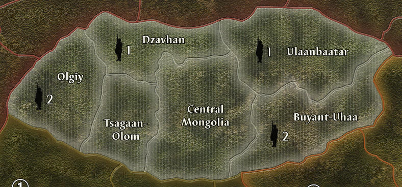
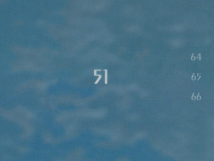
Some good progress on the map today. I’ve finished most of the country name centering and started with the adjacent to indicators on the sea zones on the edge of the map and I’m dying to hear what you guys thinks of my adjacent to attempt.
Mongolia cleaned and centered
Sea zones adjacent to test
Original map from Ambilzi and YG
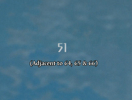
My personal attempt at a more clean and easy on the eye solution
Suggested Topics

