
Interesting . Thanks Flashman.
The Great War 1914-1918: Clash of Empires
-
@Imperious:
Note: these are from the producer, make your own list and or provide links or images of colors you feel strongly about
Most of these colours sound good to me, and for the others I have an open mind (since it depends partly on how these colours get rendered, in terms of the exact shade used), so I’ll just make a few general recommendations. To me, an important consideration would be to make sure that all the colour choices are clearly defined and well differentiated from each other. In other words: by looking at a sculpt on its own it should be possible to tell exactly what the colour is intended to be, and by looking at it alongside the sculpts of other nations there should be no possibility of confusion. An example of a bad colour choice was the original brownish-green one used in the Milton Bradley game for the US. I found it unattractive, which I admit is a matter of taste, but more fundamentally it had the problem of being in a murky, hard-to-describe colour, and of not being sufficiently different visually (especially in some lighting conditions) from the dark brown Russian units.
A few other thoughts. First, be careful with any units that are green. Shades of green are apparently hard to produce consistenly in manufacturing processes; as evidence, I can point to the A&A US infantry sculpts in my collection, of which I have about a dozen different shades. Moreover, green is a notoriously fickle colour which can look quite different in bluish daylight, reddish incandescent light and greenish fluorescent light. Second, make sure that the infantry sculpts are the same shade as the equipment sculpts. The A&A infantry sculpts in the Milton Bradley games had appreciable shade differences when compared to the equipment sculpts, for reasons I’ve never understood (perhaps they were made of a different type of plastic, or manufactured in a different production run). The same problem has cropped up in a few later games, though to a much lesser extent; for instance, there are more German infantry shades in my collection than equipment shades. Consistency across printings is nice too: the American and German units in Global 1940 2nd edition (of which I own several copies) were produced in at least two different shades each, and as far as the American pieces go the difference is so pronounced (one version has decidedly yellowish overtones) that I keep the two types of US pieces separate from each other in my storage boxes.
-
The Italians will not be a lime style green. I was wondering if the French should be like OOB 1914 or go with my preference of that more pale blue color. THe problem with OOB is the blue is the same as Union Civil War Infantry, not really French Blue…
I prefer the Russians to have that Milton Bradley Brown, Prefer the German Grey from OOB MB too.
Agree with the Americans… wrong color
-
The OOB French blue is a fairly decent match for the blue part of France’s Tricolore flag, or perhaps a bit lighter than the blue part of the flag. The current version of the French flag (dating from Valery Giscard d’Estaing’s time) is supposedly itself a lighter version of a darker older one. The current blue part is apparently something called Pantone Reflex Blue.
Personally, I like the OOB French blue from A&A 1940. If I recall, it’s a bit lighter than the French blue from A&A 1914. I wouldn’t recommend going for something much lighter. I have some pale blue (or powder blue) combat units from a couple of sources, including Xeno, and I never liked them. They’re too pastel for my taste and, to me at least, they just don’t look right in a wargame. And I wouldn’t get too much darker either, because that starts getting into the violet range.
-

-
OR THIS:

-
OR THIS:
-
I prefer the middle one (Reply #319, 05:48:45 pm) – clearly blue, and with lots of character. The first one is too pastel for my taste, and the third one looks…well, sort of dusty. I’m not sure how to express it properly; the phrase that comes to mind is that the shade lacks definition, or has weak saturation, or something like that. Anyway, my pick would be the middle one.
-
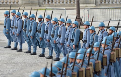
If you look at actual French ww1 uniforms they look more like option 1 and 3

-
I kinda like #3 as it does look like a “dusty blue” and I would say it matches the uniform colors in your picture perfectly!!
-
I like the 3rd choice as well (dusty blue), it seems to match the helmets.
-
The third gray-blue color posted is what I think of for Austria-Hungary. Pike-gray or what they called hechtgrau. It offsets them a bit from the Germans. A deeper blue, I would associate with France.
Turkey I tend to associate more with a khaki color, but not sure what shades are available to avoid conflict with the British.
-
Austrian color is here

-
@Imperious:
Austrian color is here
Yes, that’s the color I had in mind. Probably my favorite uniform of the early war period.
-
Simply use the historical correct colours!
And please in this regard stay away from this red/brown nonsense for Russia WWI!
It’s beige!(The RED revolution had yet to come up in 1917!)
France is on a good way! (and of course it’s colour #3!)
-
Anything remotely red will be the Ottomans, but a subdued red/tan.
Russia will be Brown/Beige
-
Hey IL,
Any update on this Gem?? Saving my Pennies! Can’t wait!!
-
4th quarter release, no definite date. Mostly done
-
Where will this game be sold on release? Any online store with international shipping?
-
Everywhere and international too ( except rules in English)
-
This game should be named “Chinese Democracy” …
Just kidding. I would do lots of things to play this finally :roll:
Any news?
Suggested Topics

