
89942069_234023921058065_8338820971033001984_n.jpg !
88106161_221519072308550_2482507379309019136_n.jpg tn5.png
Tjoek's A&A 1914 OOB Map file (Updated February 9th 2020)
-
@The-Plastic-Commando Thanks for your input. I will leave Constantinople as is, but will most likely slightly move Vienna to a more central location. For Moscow I guess I have to keep it as is…
-
@Tjoek Sounds good.
-
I’ve finished repositioning the territory names and roundels. After looking at a few maps I noticed Moscow itself could be moved more centrally and still adhere to real maps. So that was a nice surprise!
As scan always have some scanning noise, I prefer to replace the roundels with new crisp artwork. By going though all of them I noticed three things:
-
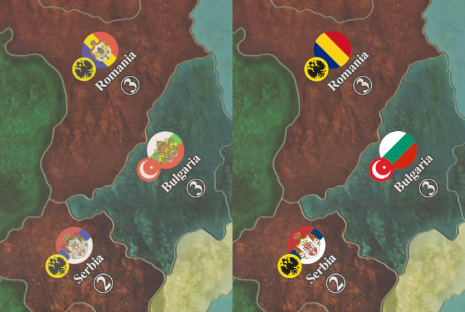
Romania, Bulgaria and Holland have their coat of arms in the roundel while that wasn’t present in the flag
-
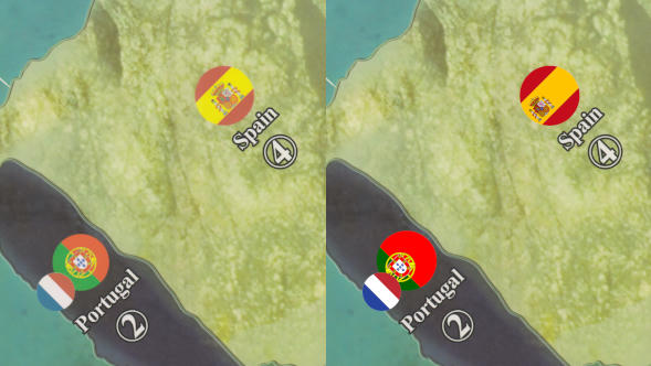
Spain and Portugal have their coat of arms off center in the real flag, but they are placed in the center of the roundel
-
Germany doesn’t have the Iron Cross in their national flag, but it happens to be their marine flag. And as it is very iconic I prefer to keep it that way
What are your thoughts on what to do for these 3 observations?
-
-
@Tjoek Hello, the map is looking great. That is good news on the Moscow roundel too. On your 3 observations, first with the German iron cross roundel you are correct. It is an iconic image of WW1 and it for sure has to stay!
Secondly, offsetting the Portuguese and Spanish coat of arms in my opinion does not fit well with the overall look of the game roundel. Aesthetically it does not flow well with the other game roundels.
Third, I personally like the coat of arms placed in the Bulgarian, Romanian, and Holland roundels as in the game map. It gives them a distinctive monarch or kingdom appearance. I love Serbian coat of arms roundel nearby. It distinguishes a WW1 map from a WW2 era map. Also, Historical Board Gaming has all of the same custom AA1914 map Roundels for sell for those interested or using house rules.
I think most people prefer the game map roundels for continuity. Your crisp and bright colors look nice. Hope this helps.
The Plastic Commando
-
@The-Plastic-Commando Thanks for your views. These were the exact same things that got me in doubt. Hence the request for some feedback. I will switch back to the original ones. As I’m from the Netherlands I personally don’t like the flag they use for Holland, but it might otherwise be mistaken for the France flag. Especially with the separate roundels that can be in any orientation.
Besides the roundels I’ve started enhancing the dull scan colors. Just as a first start I took the exact same steps as for my Anniversary map. But because the colors are different to begin with the result is not as pleasing as expected. Just a bit on the bright side. Any suggestions?
-
@Tjoek The brighter map sure does stand out. I suppose too bright could cause glare of overhead lights. I think a Matt finish would tone down some of the brightness.
-
@The-Plastic-Commando said in Tjoek's A&A 1914 OOB Map file:
@Tjoek The brighter map sure does stand out. I suppose too bright could cause glare of overhead lights. I think a Matt finish would tone down some of the brightness.
Brightness of color might also lose details in light areas. As in Spain for example, where the image is over exposed.
The glare has nothing to do with it as this is mostly the result of the material finish. Like you said a Matt finish would prevent this but would not help regaining lost details due to over exposure / to bright image.
I will be doing a few setting tweaks over the next couple of days to settle for the most pleasing one.
I’ve replaced the roundels with the more in center ones and the ones with the coat of arms. So really the only thing left is color correcting and trying a slightly better rendering of the Sahara. So I’m guessing it’s a matter of 1 or 2 weeks max before I can release the finished map file!
-
@Tjoek I see what you mean on the detail part. All in all it’s looking great though. 👍
-
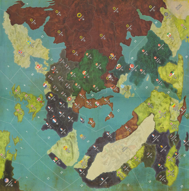
As far as I’m aware the map is finished! Finally!
Please review the full size map at this
linkand give any feedback. I will go over it once more myself in a couple of days before releasing the map as final. -
@Tjoek Absolutely…Wow! You did an amazing job on the color capture and with the roundels. The map looks so much better without the gray port symbols on the board too, and of course, the cleaned up Sahara area. I compared your map to my game board and really am not finding anything to add or critique. For some reason my zoom of the map the further I go in somewhat distorts the names on the board, but as long as they are clear and crisp when printing out, I think the map looks great.
Do you think the final map will print out well around 48x48 in size and keep the detail?
-
@The-Plastic-Commando
You should be fine with a 48 inch print, but don’t print this file yet. There is still a mistake near Rome. The city marker is partly overlapping the Italian roundel, but this overlapping bit of the city marker is still in the old colors before I enhanced them. I forgot to include that layer when I enhanced the colors…Did you notice the two roundels that are different then the original board design? :-)
-
@The-Plastic-Commando said in Tjoek's A&A 1914 OOB Map file:
For some reason my zoom of the map the further I go in somewhat distorts the names on the board, but as long as they are clear and crisp when printing out
If you zoom in to the level you can tell the individual pixels apart it will look a bit distorted. But you will not see this when you print the map as this will nowhere near this level of zoom. Unless you print a map over 86x86 inch or something. And who will ever do that?
-
It takes a while for the image to clear, that’s a function of your computers memory processing power.
I like what i see, but i still like my file better because all the artwork is VECTOR BASED and not an image or scan of an image. Don’t like the OOB sea color or lines either but that’s subjective
-
@Tjoek Well now that you mention it, Holland looks a bit different with the crest in the roundel. I’m not noticing a second roundel different lol
-
@The-Plastic-Commando said in Tjoek's A&A 1914 OOB Map file:
@Tjoek Well now that you mention it, Holland looks a bit different with the crest in the roundel. I’m not noticing a second roundel different lol
1.) Holland has a different crest I took from the official royal standard from that time. The blue shield in the middle of it is actually the same as in the original artwork.
2.) Persia has a slightly different roundel as well. The red is less strong and the lion is smaller. According to the internet (wikipedia) this is the right flag from that era. The one HBG has for sale has a larger lion and stronger red, but that flag is from a few decades earlier.
-
@Imperious-Leader said in Tjoek's A&A 1914 OOB Map file:
I like what i see, but i still like my file better because all the artwork is VECTOR BASED and not an image or scan of an image. Don’t like the OOB sea color or lines either but that’s subjective
Thanks IL, everyone their own preferences. Vector images do have the advantage of scaling indefinitely and still be crisp and clear but they often lack the depth of texture and dynamic colors that I personally find far more pleasing to the eye. And in my experience you don’t need that scalability when you print your maps for decent gaming tables. Unless off-course you want a wall-size carpet hanging in your gaming room ;-)
-
@Tjoek 👍
-
@Tjoek :+1:
-
Just another question to you guys:
The Germans have the ability to declare “Unrestricted Submarine Warfare” which means that their subs in sea zones 2, 7, 8 have the ability to raid US and UK convoys. I could mark those sea zones on the map with a semi transparent icon of a sub as a reminder that these 3 sea zones are affected.What are your thoughts on this?
Update on the map
Besides I have spotted a few minor mistakes and small things I want to revisit on the map. Nothing big, but some text not being as white as it could be, some better centering of territory names and fix some text deformation that happened during stitching of individual scans: For examples the M in Mesopotamia had a small kind of wiggle in it.Expect an updated map somewhere this week.
-
@Tjoek Hey Tjoek, I kind of like the sea zones without a submarine icon. It stays true to the other zones of the map without icons. 😊
Suggested Topics


