
TRICK OUT YOUR OOB MAPS WITH ARTWORK CUT FROM YOUR SPARE/DUPLICATE RULEBOOKS, LINK IS HERE!!! https://youtu.be/QMkfdDdvqus
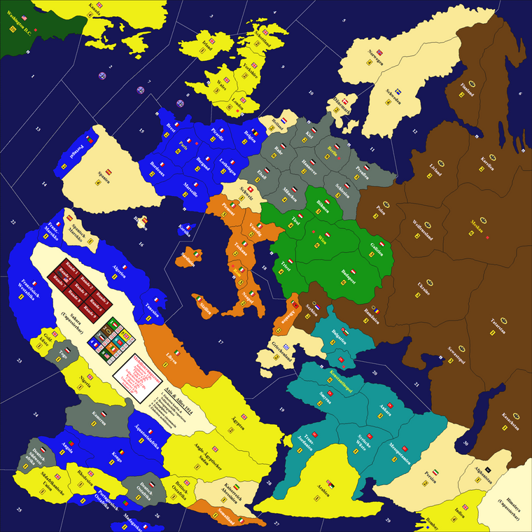
Tjoek's A&A 1914 OOB Map file (Updated February 9th 2020)
-
@Chacmool Until now I used this custom map to play OOB A&A14 (I only enlarged Western Europe esp. Ruhr/Elsaß/Switzerland/Piedmont, you can see that Gibraltar moved a little bit westwards)
-
This post is deleted! -
@Chacmool I will share a version with and without harbors. Concerning the Mobilization zone / any artwork on the Sahara I can do this too. But It won’t have the map fold fixed.
Another option is to add the mobilization zone back to the cleaned Sahara artwork.
-
@Tjoek I like the idea of removing the harbor symbols as I too like using my acrylic markers.
The map is looking fantastic and thank you for the dedicated hard work.
-
@Tjoek said in Tjoek's A&A 1914 OOB Map file:
Boost colors to be more vibrant as the scans are a bit dull
I am very curious how this will finally look like. We always loved the colors of the oob 1914 map.
-
I would like to call in your support on this map. While finishing the re centring of names and IPC values I struggle with the capital cities. At the moment Vienna and Moscow are badly centred from a roundel and IPC perspective.
At the same time I noticed something concerning the capital cities I didn’t pay attention to before. Most territories with capital cities have NO territory name, only the city itself. Except for USA/Washington and Constantinople:
- USA/Washington: Next to Washington the territory itself has the obvious name
- Constantinople: The city doesn’t have a name in small font. The whole territory is named Constantinople in large font
With Constantinople there isn’t much to do while keeping everything else in balance, but it raises a few questions I would love to hear your views on:
- Vienna: the roundel and IPV value could be moved downward including the capital city. This might not be very accurate (I didn’t check) but would be the easiest solution
- Moscow: moving the city with the roundel and IPV value is a bit too much. But I could do something similar as USA by naming the territory Russia and leave Moscow where it is located.
- Constantinoplee: does anyone have problems with how Constantinople currently is? I think it’s the best with the map as a smaller font city name might not make it apparent that both sides of the straight are the same territory.
What do you guys think?
-
@Tjoek My guess is that the reason the OOB map only has the U.S.A. listed with the addition of the capital city of Washington is that the remainder of the powers are Empires with sprawling territory and/or colonies. Calcutta is listed in India as a means of simply introducing units for the British. I think keeping Calcutta the same is fine. I don’t have a problem with the centering of the Vienna and Moscow roundels. Adding new territory names may make things even more crowded.
-
@The-Plastic-Commando
Thanks for your feedback! Reading your response I concluded I made a ‘capital’ mistake.
Where I wrote Calcutta it should read Constantinople. You’re absolutely right about Calcutta.So what do you think of Constantinople only having a large territory name instead of the small capital name?
P.S. I’ve updated my previous post to prevent any more confusion.
-
@Tjoek I personally don’t have a problem with the size on Constantinople. It seems to fit better on Asia Minor.
-
@The-Plastic-Commando Thanks for your input. I will leave Constantinople as is, but will most likely slightly move Vienna to a more central location. For Moscow I guess I have to keep it as is…
-
@Tjoek Sounds good.
-
I’ve finished repositioning the territory names and roundels. After looking at a few maps I noticed Moscow itself could be moved more centrally and still adhere to real maps. So that was a nice surprise!
As scan always have some scanning noise, I prefer to replace the roundels with new crisp artwork. By going though all of them I noticed three things:
-
Romania, Bulgaria and Holland have their coat of arms in the roundel while that wasn’t present in the flag
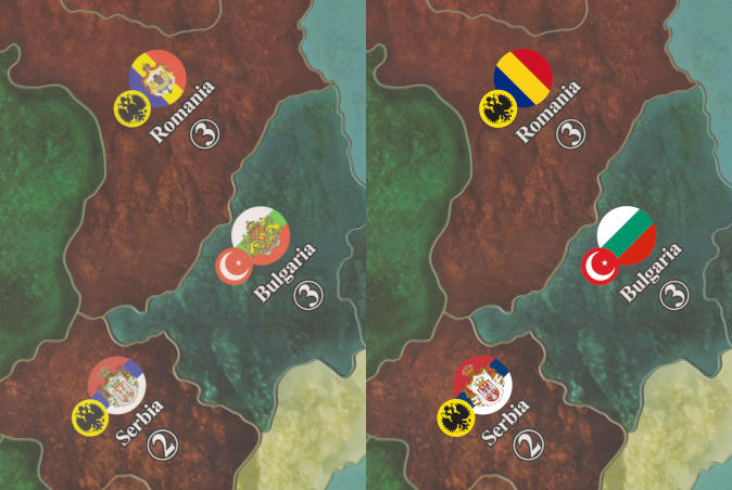
-
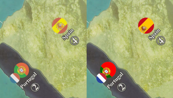
Spain and Portugal have their coat of arms off center in the real flag, but they are placed in the center of the roundel
-
Germany doesn’t have the Iron Cross in their national flag, but it happens to be their marine flag. And as it is very iconic I prefer to keep it that way
What are your thoughts on what to do for these 3 observations?
-
-
@Tjoek Hello, the map is looking great. That is good news on the Moscow roundel too. On your 3 observations, first with the German iron cross roundel you are correct. It is an iconic image of WW1 and it for sure has to stay!
Secondly, offsetting the Portuguese and Spanish coat of arms in my opinion does not fit well with the overall look of the game roundel. Aesthetically it does not flow well with the other game roundels.
Third, I personally like the coat of arms placed in the Bulgarian, Romanian, and Holland roundels as in the game map. It gives them a distinctive monarch or kingdom appearance. I love Serbian coat of arms roundel nearby. It distinguishes a WW1 map from a WW2 era map. Also, Historical Board Gaming has all of the same custom AA1914 map Roundels for sell for those interested or using house rules.
I think most people prefer the game map roundels for continuity. Your crisp and bright colors look nice. Hope this helps.
The Plastic Commando
-
@The-Plastic-Commando Thanks for your views. These were the exact same things that got me in doubt. Hence the request for some feedback. I will switch back to the original ones. As I’m from the Netherlands I personally don’t like the flag they use for Holland, but it might otherwise be mistaken for the France flag. Especially with the separate roundels that can be in any orientation.
Besides the roundels I’ve started enhancing the dull scan colors. Just as a first start I took the exact same steps as for my Anniversary map. But because the colors are different to begin with the result is not as pleasing as expected. Just a bit on the bright side. Any suggestions?
-
@Tjoek The brighter map sure does stand out. I suppose too bright could cause glare of overhead lights. I think a Matt finish would tone down some of the brightness.
-
@The-Plastic-Commando said in Tjoek's A&A 1914 OOB Map file:
@Tjoek The brighter map sure does stand out. I suppose too bright could cause glare of overhead lights. I think a Matt finish would tone down some of the brightness.
Brightness of color might also lose details in light areas. As in Spain for example, where the image is over exposed.
The glare has nothing to do with it as this is mostly the result of the material finish. Like you said a Matt finish would prevent this but would not help regaining lost details due to over exposure / to bright image.
I will be doing a few setting tweaks over the next couple of days to settle for the most pleasing one.
I’ve replaced the roundels with the more in center ones and the ones with the coat of arms. So really the only thing left is color correcting and trying a slightly better rendering of the Sahara. So I’m guessing it’s a matter of 1 or 2 weeks max before I can release the finished map file!
-
@Tjoek I see what you mean on the detail part. All in all it’s looking great though. 👍
-
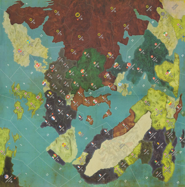
As far as I’m aware the map is finished! Finally!
Please review the full size map at this
linkand give any feedback. I will go over it once more myself in a couple of days before releasing the map as final. -
@Tjoek Absolutely…Wow! You did an amazing job on the color capture and with the roundels. The map looks so much better without the gray port symbols on the board too, and of course, the cleaned up Sahara area. I compared your map to my game board and really am not finding anything to add or critique. For some reason my zoom of the map the further I go in somewhat distorts the names on the board, but as long as they are clear and crisp when printing out, I think the map looks great.
Do you think the final map will print out well around 48x48 in size and keep the detail?
-
@The-Plastic-Commando
You should be fine with a 48 inch print, but don’t print this file yet. There is still a mistake near Rome. The city marker is partly overlapping the Italian roundel, but this overlapping bit of the city marker is still in the old colors before I enhanced them. I forgot to include that layer when I enhanced the colors…Did you notice the two roundels that are different then the original board design? :-)
Suggested Topics

